Project Details
Location: Sudbury, MA
Type of Home: Colonial
Sq. Footage: 3,300 sq. feet
Year Built: 2006
Project Scope
It’s an absolute joy to work with amazing clients on a project for their home, but when they hire us again and again? Even better. Over time we become more in tune with their vision and style, and we are able to hone in on the best ways for us to work together, allowing us to create even better finished spaces for them.
Case in point: our lovely Sudbury clients. A family of three, they’ve lived in their home for almost six years now and we’ve loved getting to know them, as we continue to help make this home truly authentic to them. First we tackled their master bedroom, followed by their main living room, loving every bit of our creative time together.
So when they called looking for help makeover their formal living room, we jumped at the chance to work together again. This time around we’d be implementing their classic look in this special room, but with a more sophisticated feel, all the while, still striving to include a bit of the Bohemian style they love.
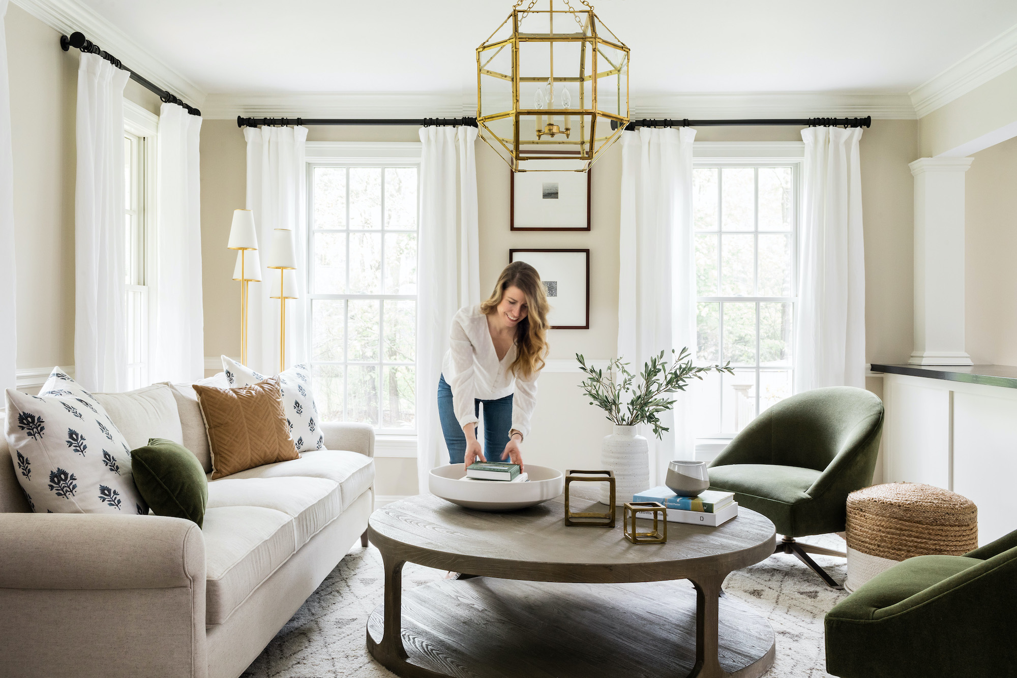
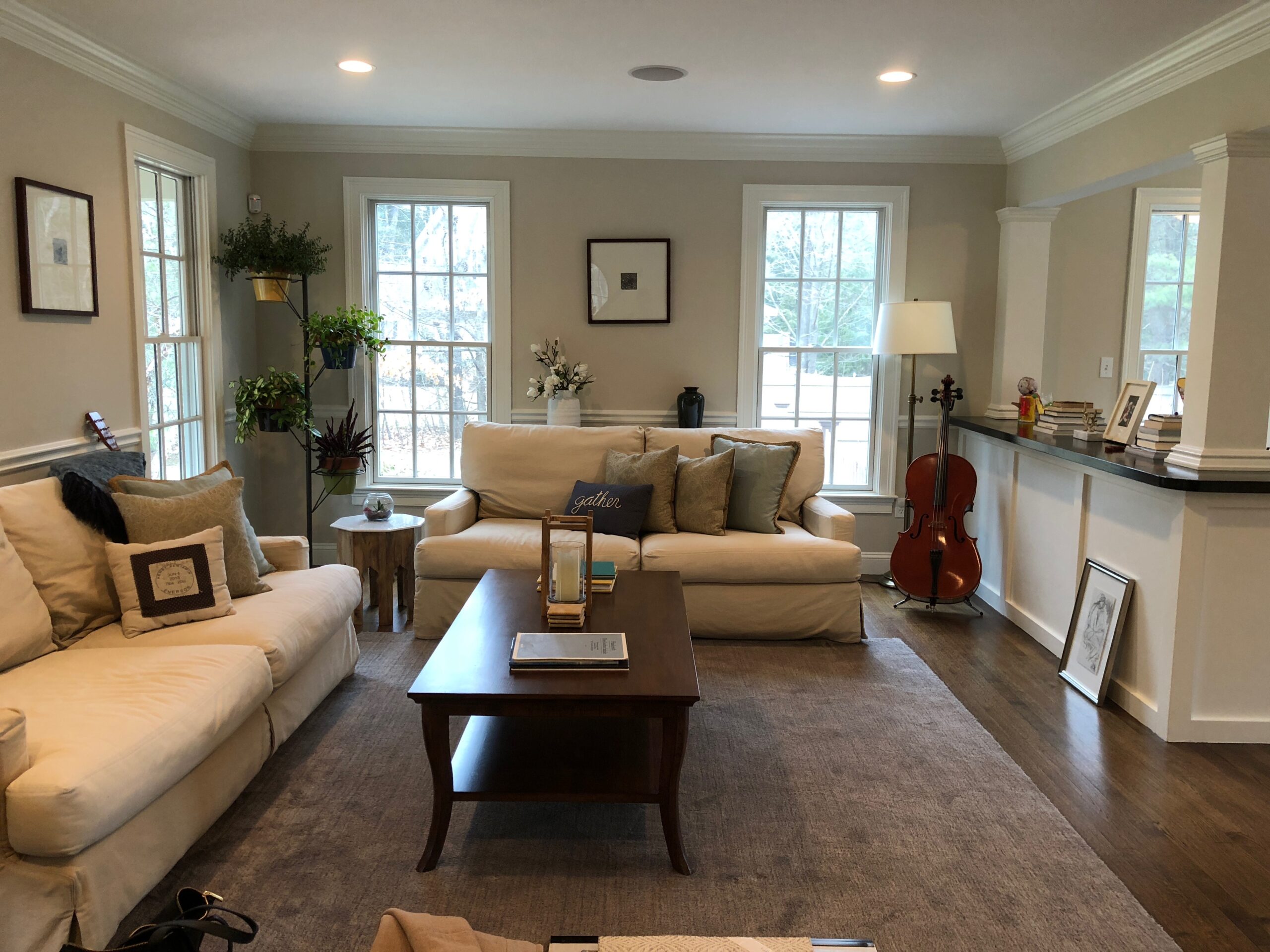
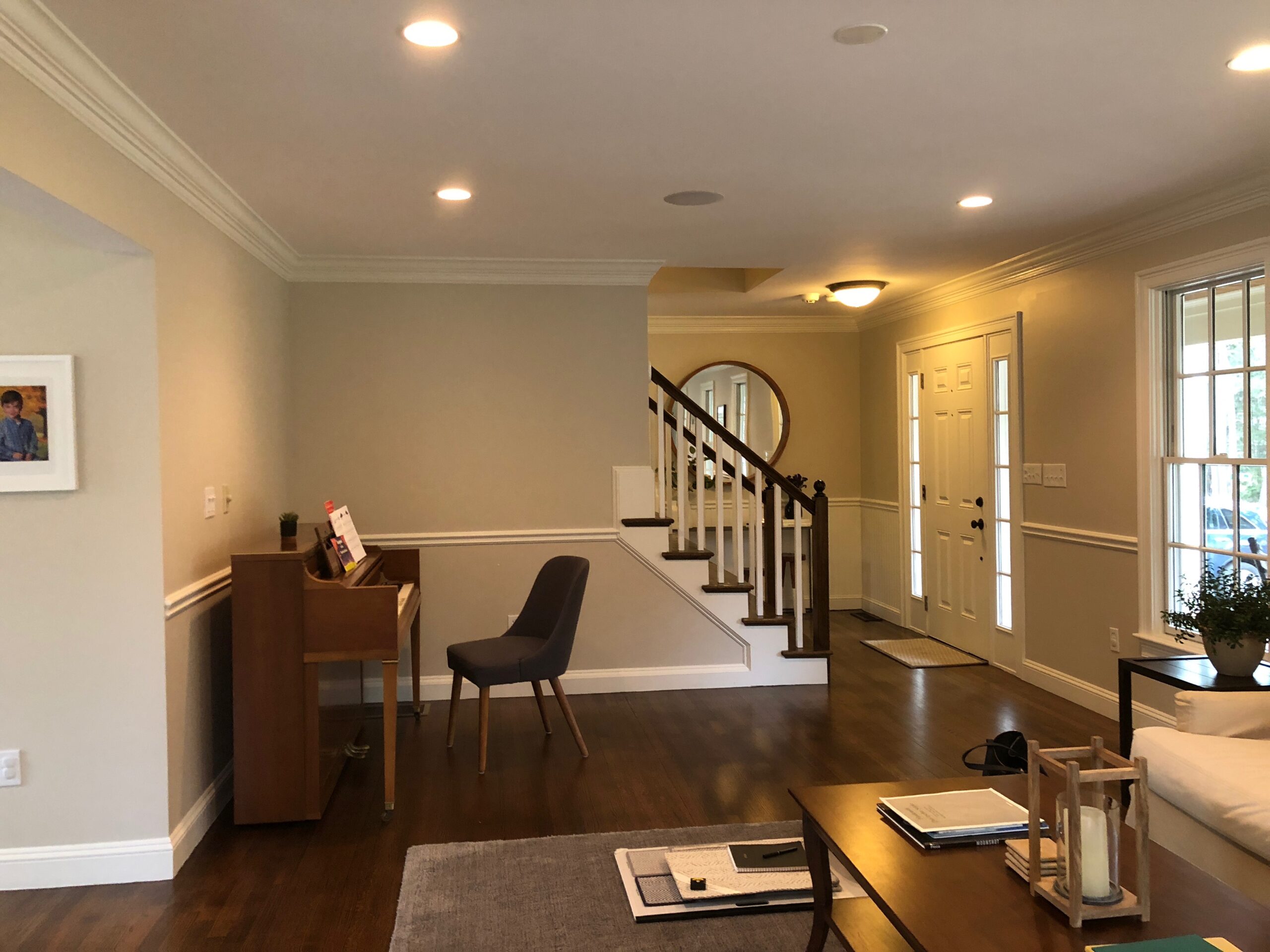
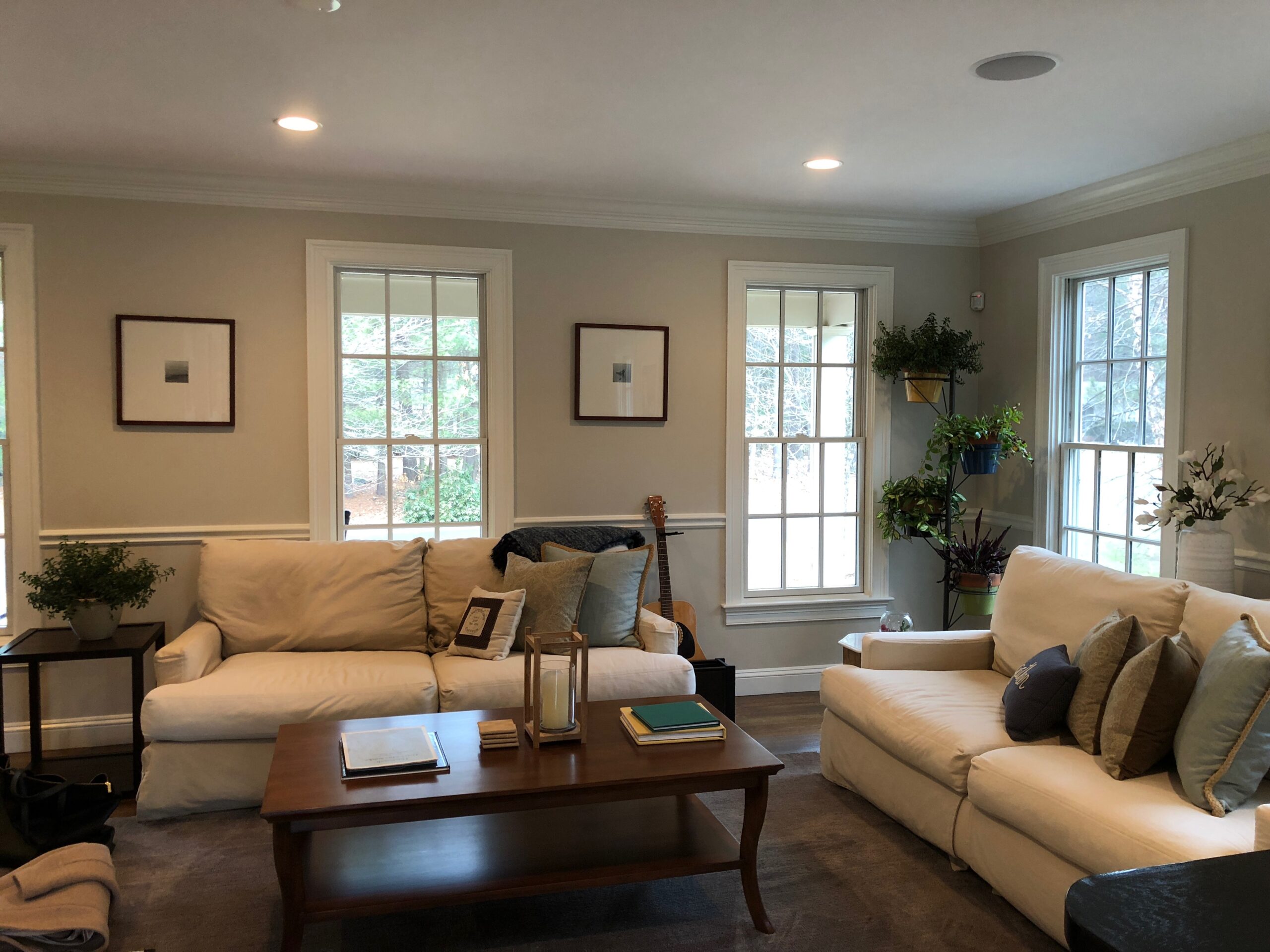
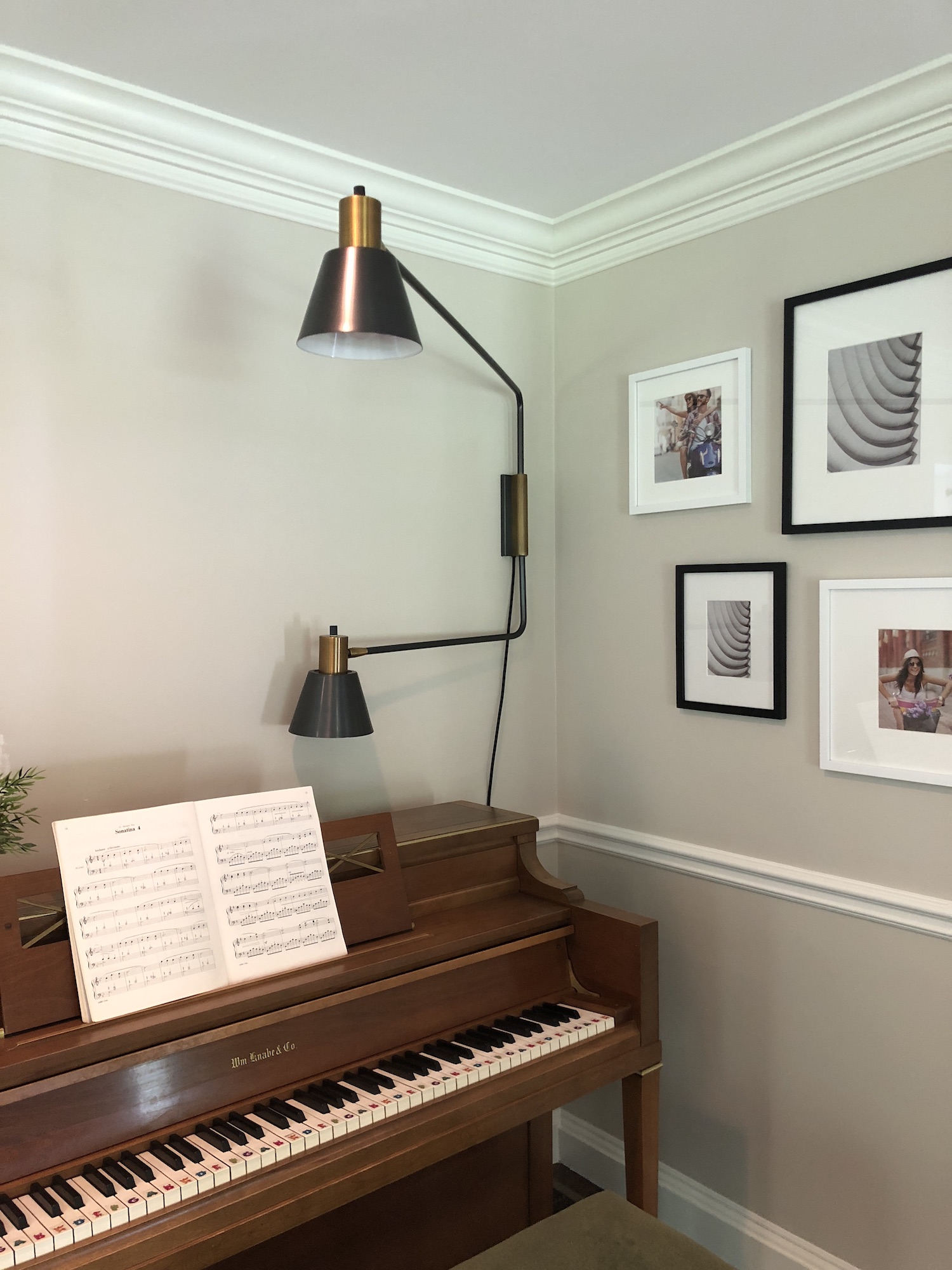
Their formal living room is the first room you see when you walk through their front doors so we wanted it to be a polished greeting, while still aligning with their own unique personality and style. The room doesn’t have a television, it is instead used primarily for family to gather during the holidays and a place to play music together. The current furniture was a mismatched blend from previous homes; all of this is to say a cohesive look was in need. We got to work!
Design Direction
Similar to their main living room and their master bedroom, we wanted to achieve a look that was put together and purposeful, but still welcoming and approachable. So while it may be a formal living room, it is still part of a family home, a family home with children, one that needs to be classy yet comfortable.
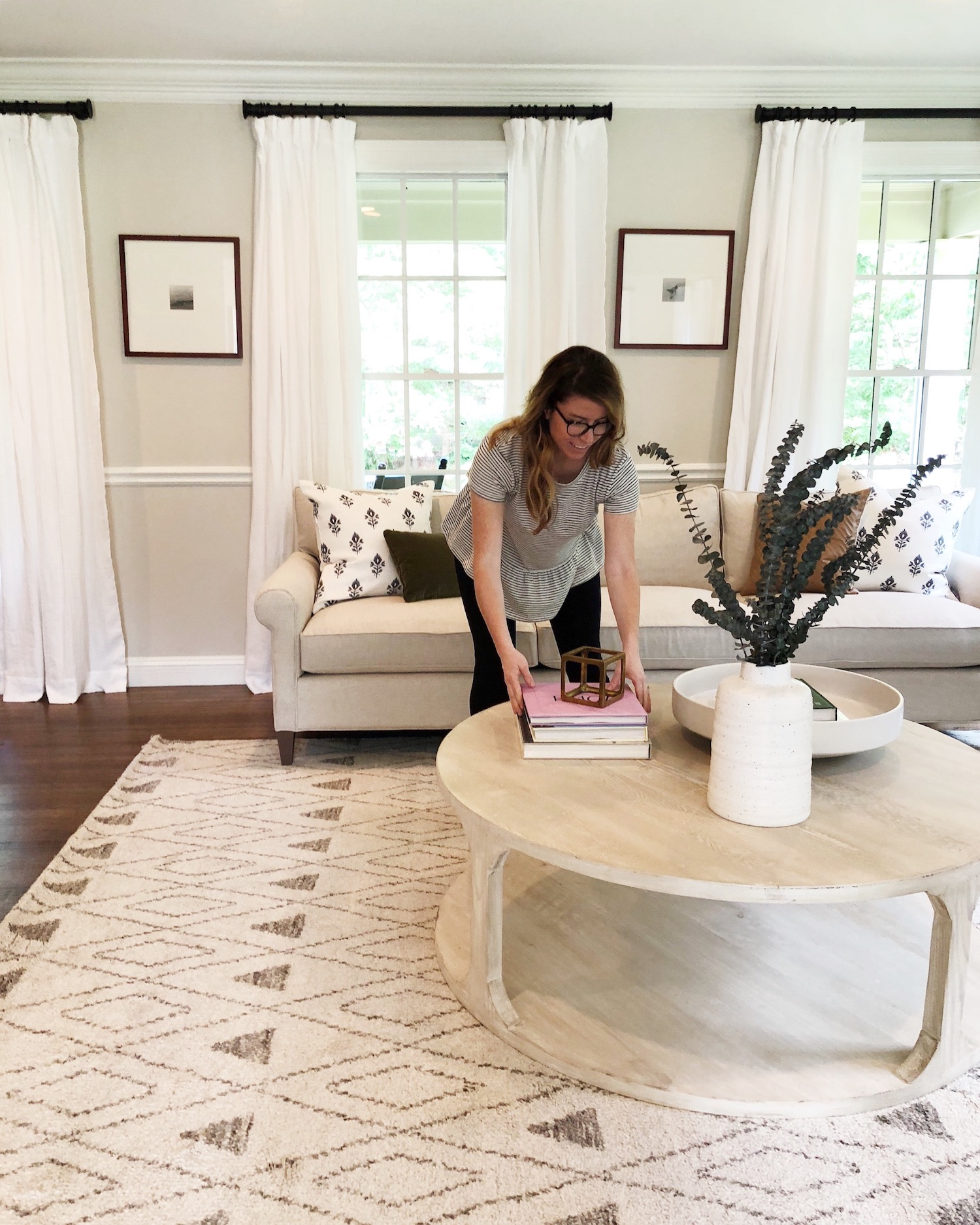
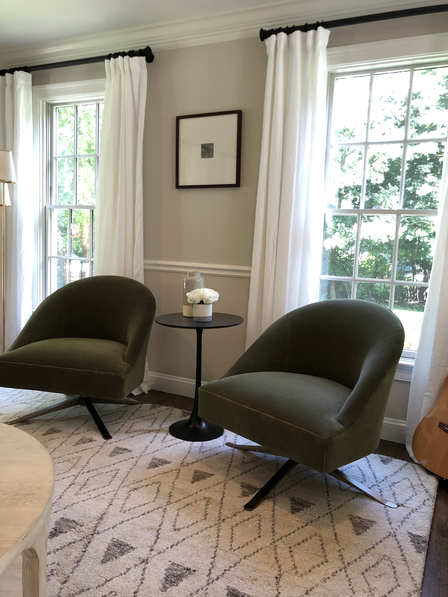
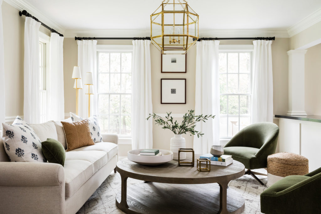
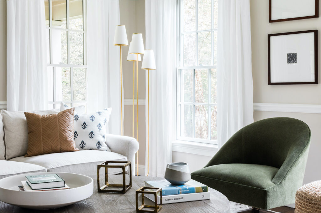
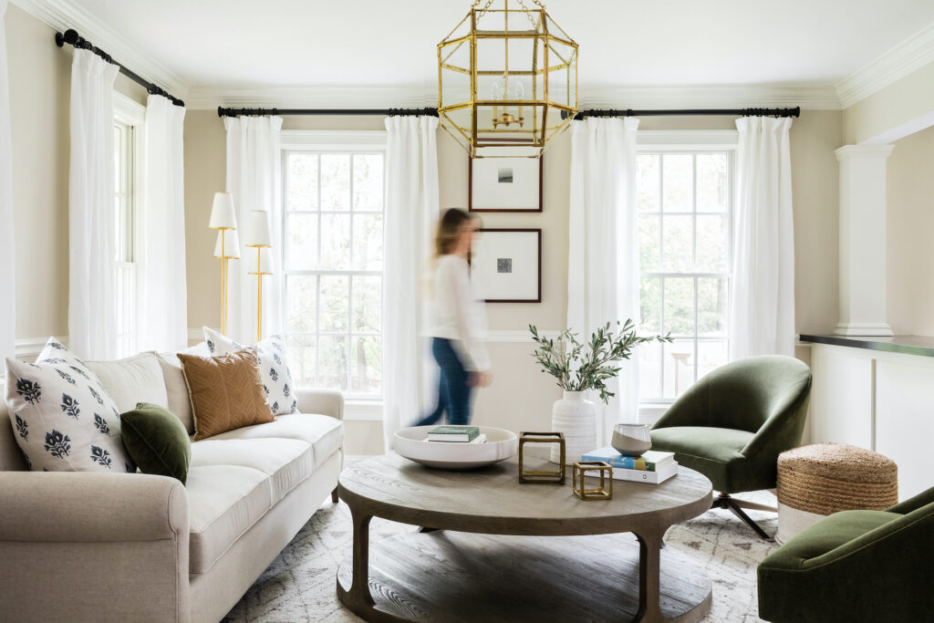
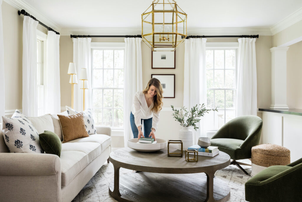
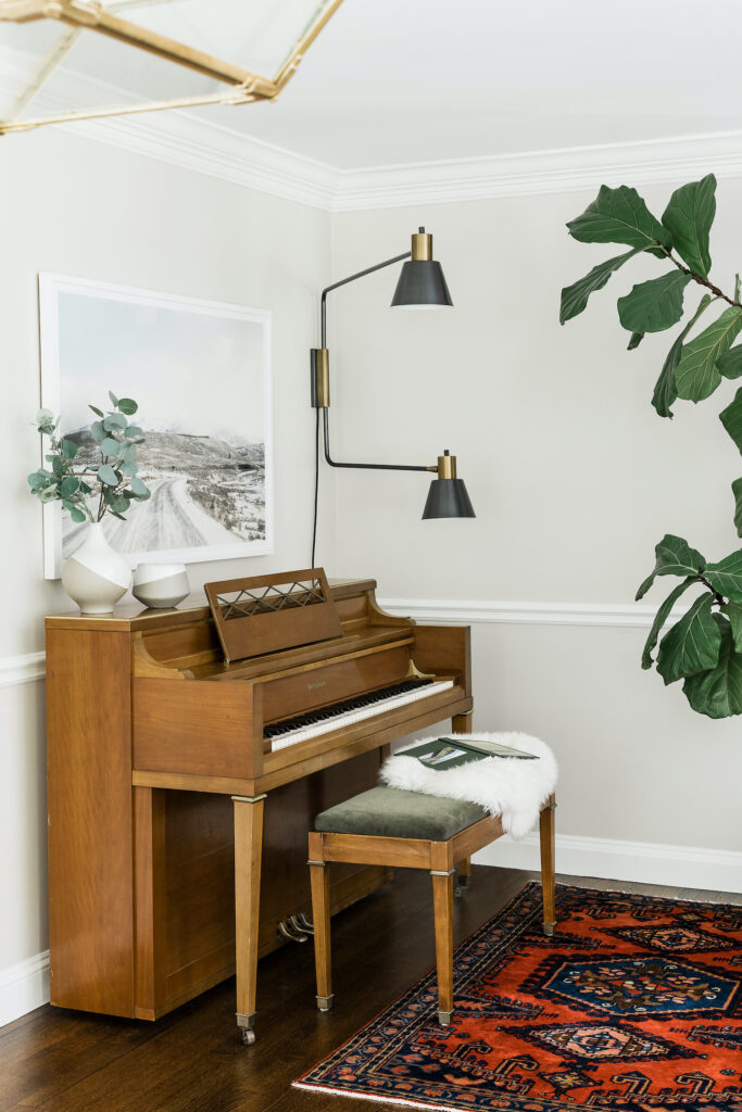
We presented a couple different ideas for the space and ultimately decided on a gorgeous mossy green color to be the focal point, then created a layered, neutral look from there. The mossy green fabric chairs, pillow, and piano bench is a Lee Furniture fabric that we also used on the piano bench cushion and on a pillow as well. It helps to pull the green hue cohesively throughout the room really nicely.
We were a bit undecided with window treatments, as you can see the dining room from this space (it’s on the other side of the counter with the columns) and there are many windows in that space as well. I thought it might be nice to continue the same treatments throughout the formal living room as the dining room, since it does have a sense of being one large room at times.
With the window treatments staying consistent, we turned our attention to some new specific lighting in the formal living room. We wanted it to be a focal point in the space, and so we went with a couple of stunning brass fixtures from Circa. Every time I post about this space, I get inundated with compliments on these pieces!
We went with one of my favorite neutral shades for the walls, the gorgeous Edgecomb Gray HC-173 by Benjamin Moore. (More about my go-to neutral hues right here!), really helping to pull the whole transformation together.
Also, you will see a couple of different coffee tables as we had some quality issues with the original one and then swapped it out and had similar issues…so ended up with the one in the after photos!
Before Photos
Progress Photos
After Photos

Shop the Look

Swivel chair *You have to find a retailer for this swivel chair since this is to the trade
Final Thoughts
The whole look came together wonderfully and the client was thrilled with the finished product! Everyone was so pleased with the beautiful balance we achieved, creating a formal space that still invited you into it and made you want to stay. It’s safe to say we’re in love with this client and are eager and excited to hopefully work with them again… maybe to get our hands on their dining room!
Final photography credit: Joyelle West

