I’ve been looking forward to sharing this interior design project for a few months now, so I’m extra excited to dive in and give you the details! We had the pleasure of working with our clients on their condo renovation last year and we love how the space transformed. So you can really get an idea of what went into this project, I’m sharing some in-process photos, as it takes a lot to get from “BEFORE” to “AFTER”. It takes months of planning, details, decision making, fires to put out, furniture re-selections, returns of broken or wrong pieces sent from vendors (luckily this one didn’t have many), and much more. But one look at this end result, and you’ll agree, it was well worth the hard work.
Project Details:
Location: On the end of both the Back Back and South End neighborhoods of Boston (an amazing sought-after location)
Type of Home: Condo in a beautiful brownstone
Sq. Footage: 1160 sq ft.; 2 bed, 2 bath
Year Built: 1890
Project Scope:
We had the entire condo painted, renovated both bathrooms entirely, and the clients had new windows and window treatments installed with a bit of our guidance on selections. We designed all rooms and sourced all furnishings, lighting, rugs, art, and decor.
Design Direction:
We were excited about this project from the very beginning as our clients share our love for West Coast casual style, so safe to say, our relationship hit it off from day one. The more experience I get under my belt, the more I realize that that is the recipe for a super successful project when the clients’ personalities align with mine, and our vision is able to come to life with a level of trust; it no doubt played a major role in this project’s success. Our clients envisioned their condo to be bright and contemporary but still casual, and neutral in tone with some contrasting elements; with that inspiration leading the way, we got to work.
Before Photos:
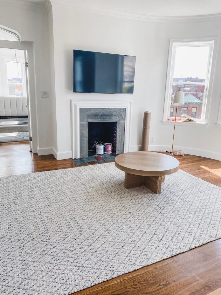
Note: Our client didn’t live in the condo prior to construction and our work but I include a couple BEFORE photos so you can get a sense of what was originally set up.


Progress Photos:


After Photos:


Paint:
We painted all of the walls in the home Benjamin Moore’s Simply White OC-117, one of my go-to whites, and did Benjamin Moore’s Super White OC-152 on the ceiling. The consistent white throughout the apartment created a cohesive, fresh look and made the space feel bigger.
Living Room Notes:
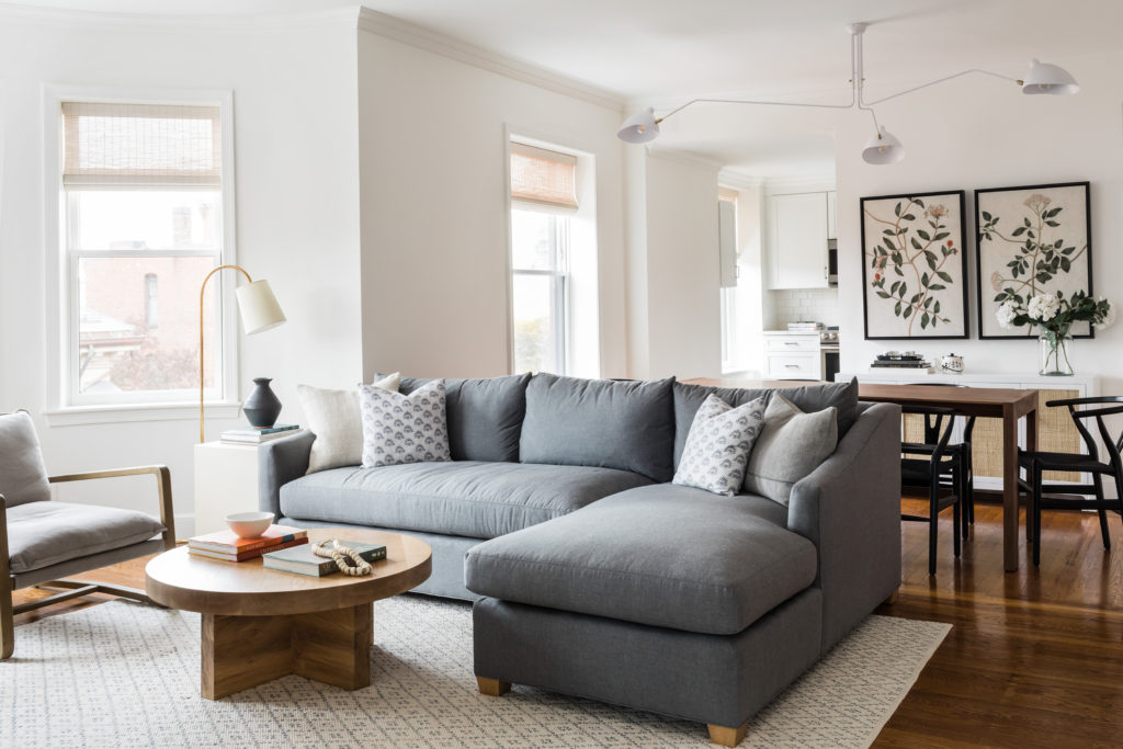
The layout of the living room was a bit challenging as it’s a small space, but our clients still really wanted a sectional. After a bit of searching, we decided on a custom option through Maiden Home that our client was able to go sit on while they were in New York. I’m glad that we went with the darker charcoal color as it gives the room a bit of added contrast and it grounds the space. We love how much natural light the entire apartment receives, and this living room, in particular, makes us so happy!
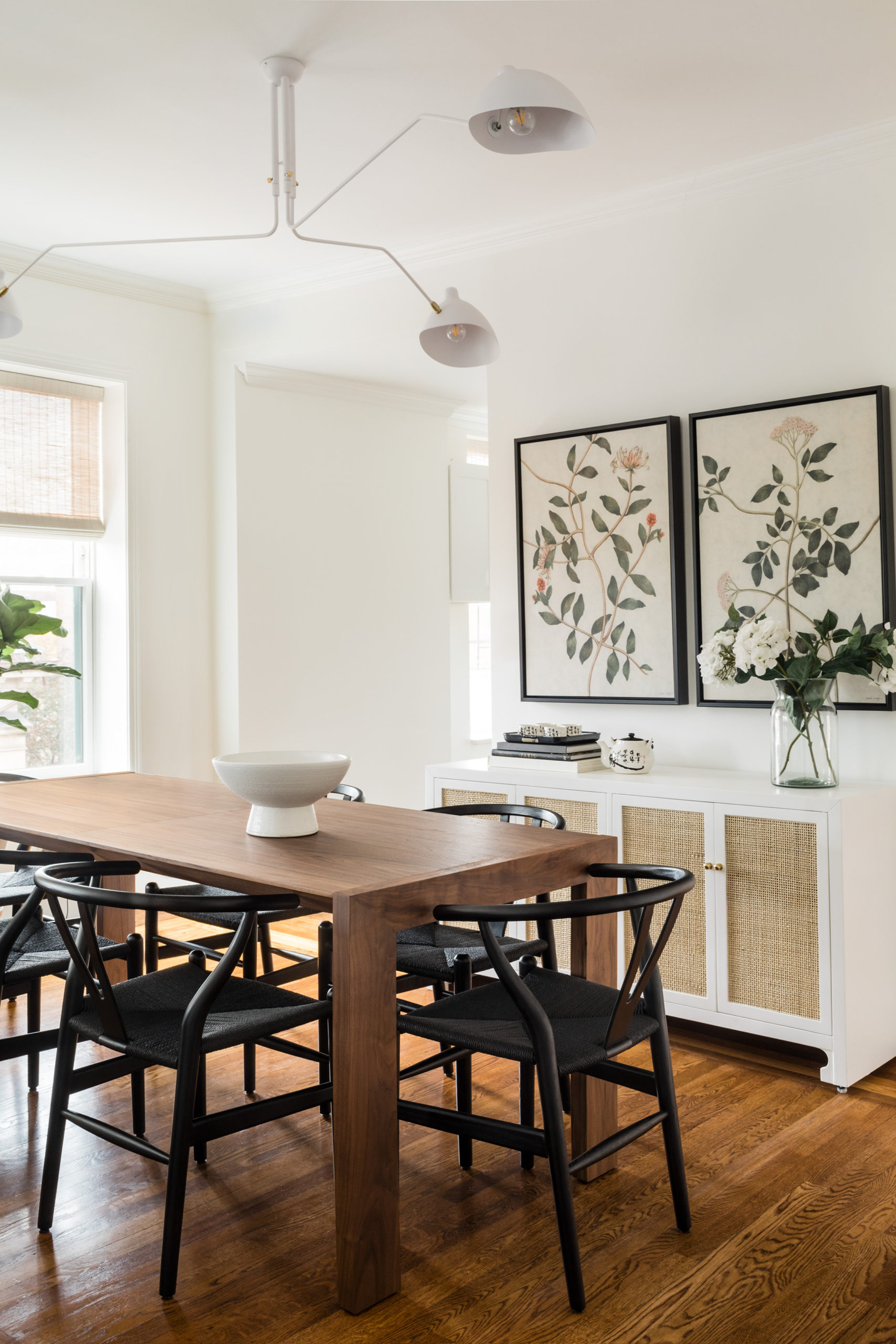
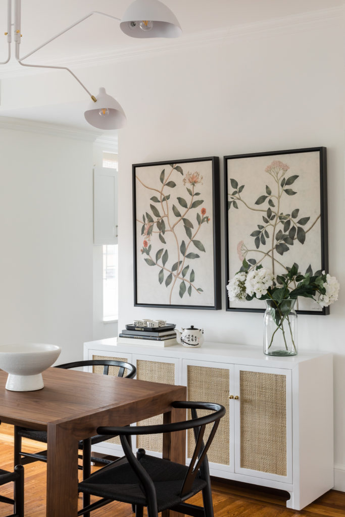
It was a bit tricky to fit the dining table with the wishbone chairs AND a buffet, but we made it work! I’m obsessed with the buffet so I was determined to make it fit in the room well.
The artwork in the dining room was another major success. The clients shared their initial inspiration notes when it came to their ideal artwork and we found the perfect fit for those wishes: floral, Asian motifs, and landscape art, all in one gorgeous piece.
Bathroom Notes:
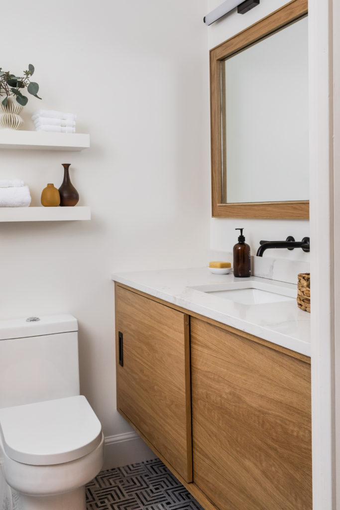
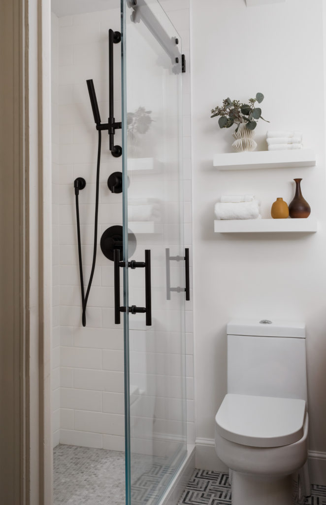
We were thrilled that this Ann Sacks floor tile was approved; we were huge fans and so excited to use it in a project! It is SO beautiful in person and gives this small bathroom a lot of personality. We had both vanities custom made by our awesome team of contractors in a white oak. We love how the matte black fixtures give a bit of classic contrast but the spaces still feel really modern and fresh.
Bedroom Notes:
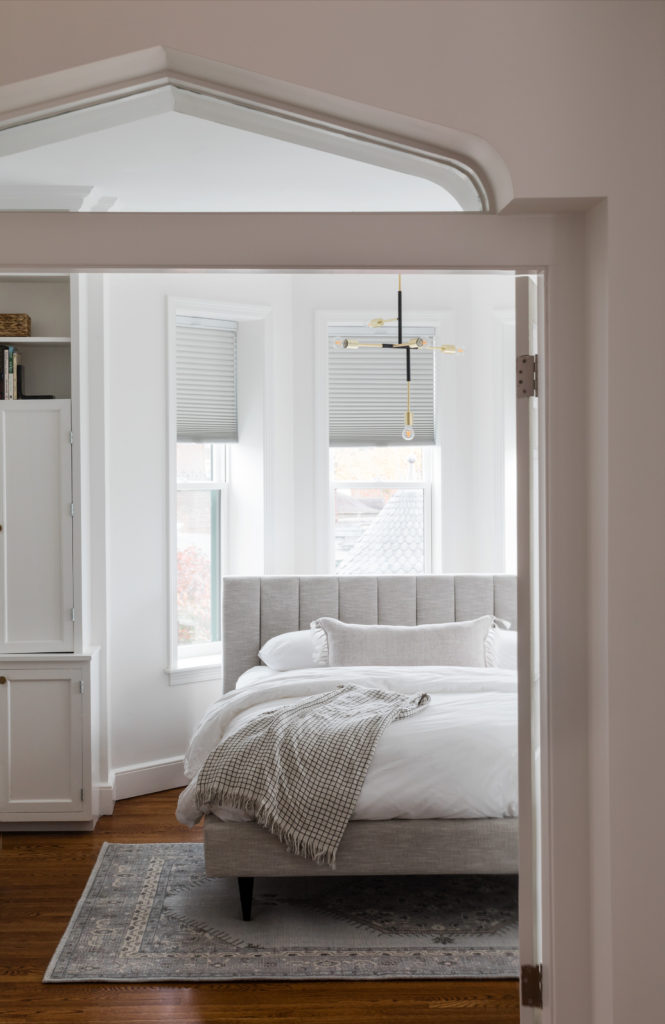
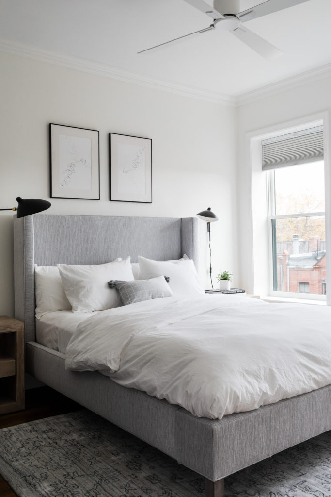
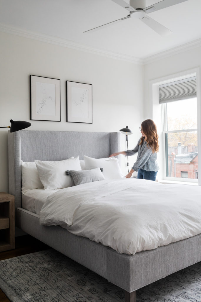
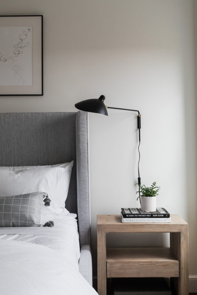
I’m obsessed with both bedrooms – the views and natural light are AMAZING! The design for both was minimal, but in the best way possible. Simple but still so cozy.
This project was a dream to work on for the Oh, I Design team and we are thrilled with the results – and even more thrilled with how pleased the clients were. My only wish is that we would’ve taken a few more photos! Can’t wait to share more project reveals soon – let me know if there are any spaces you’re especially interested in seeing!

