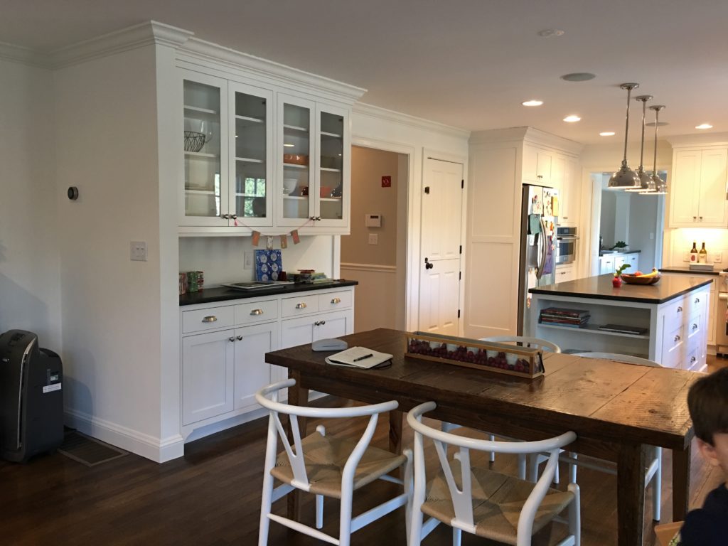
I couldn’t be more excited to finally share the before and after photos of an interior design project we completed last year in Sudbury, MA. As you may remember, we also designed their master bedroom a few years back and I’m thrilled that we’ve had the opportunity to continue to work together on their beautiful home.
A couple goals for the living room and kitchen area:
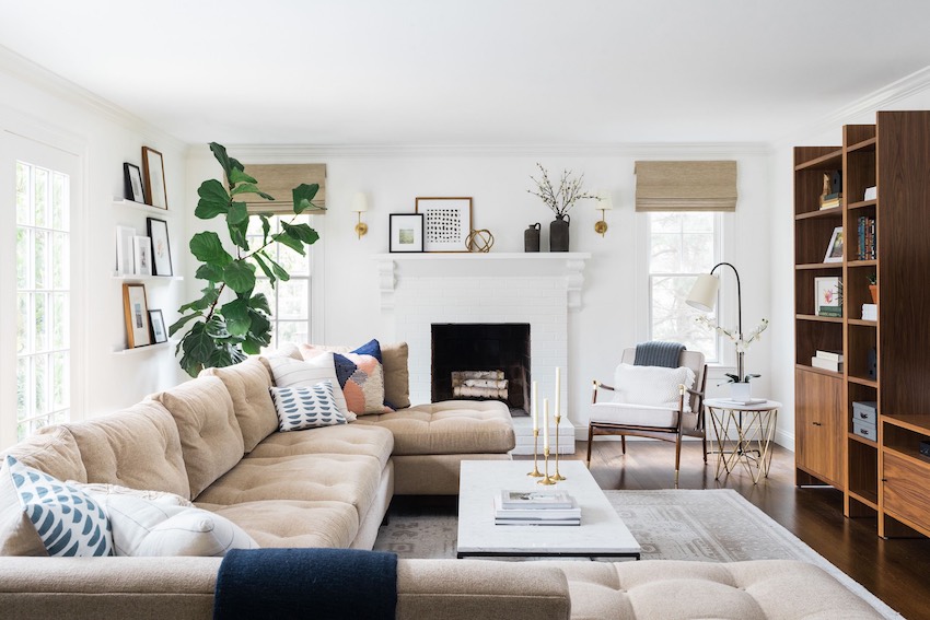
.01 Since this family spends the majority of their time in the living room and kitchen, they wanted this to be a place where their family could relax after a long day but also feel pulled together to match their design style(s).
.02 Make

A couple challenges we faced:
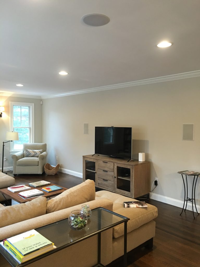
.01 This is a long and narrow room so there really wasn’t another way to set up the room with the amount of seating (comfortable and accent) needed. We kept the Arhaus Sectional and added a middle piece to make it longer and placed a large area rug underneath to ground the sectional.
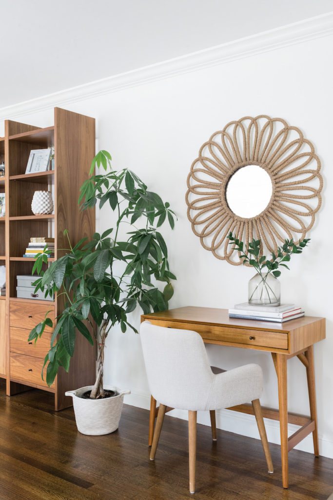
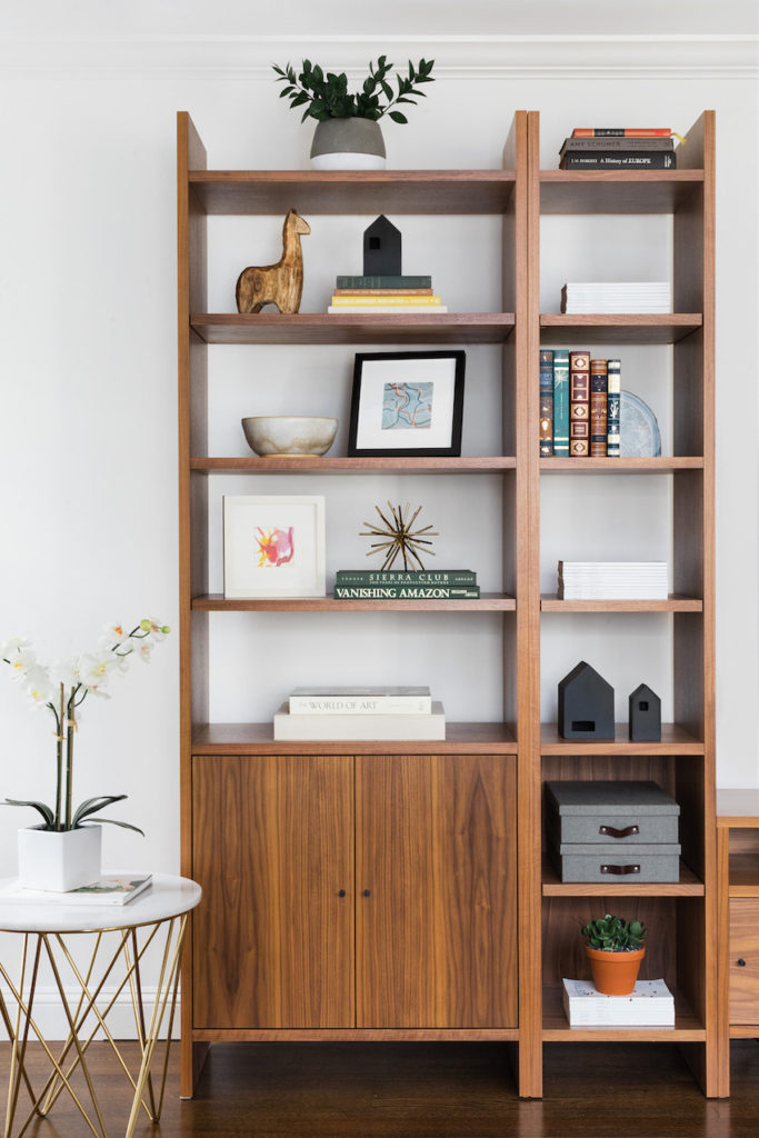
.02 Another challenge we faced was that you could see all the wires from the tv and while they wanted to mount it, there were issues with the speakers that were already built into that wall that would make it off center. I found a large customizable bookcase from Room & Board that was perfect for this wall – it gave it a custom look, hid the wires and speakers and made that wall more serve more of a purpose.
Take a peek below at the photos and I’d love to hear your thoughts in the comments. As a thank you for your ongoing support, I’ve included most of the sources at the bottom of this post (some pieces were no longer available).
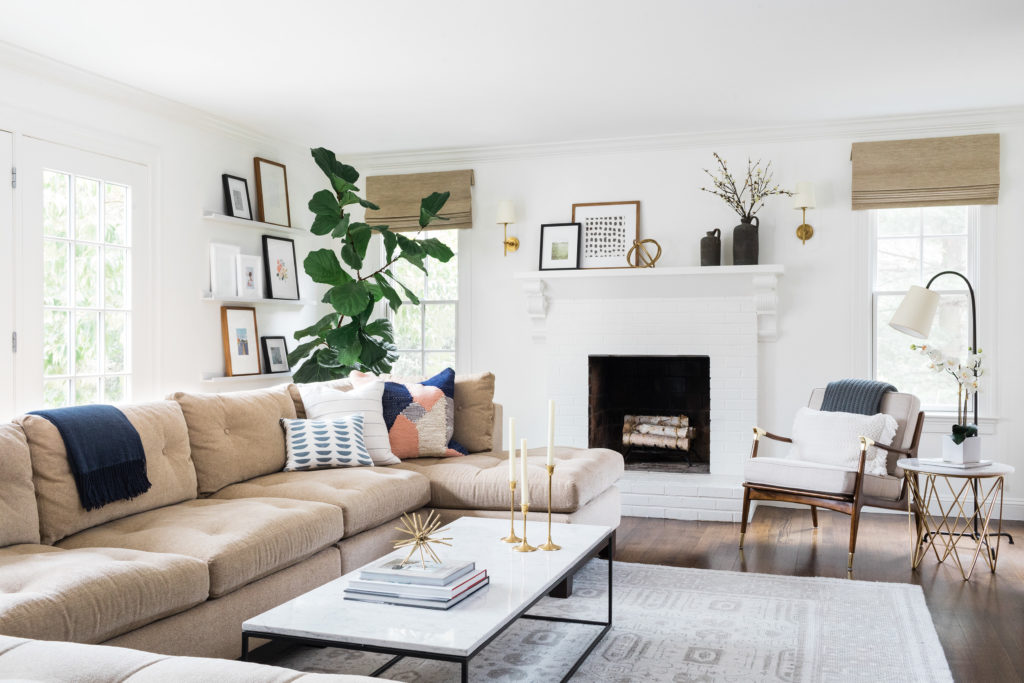
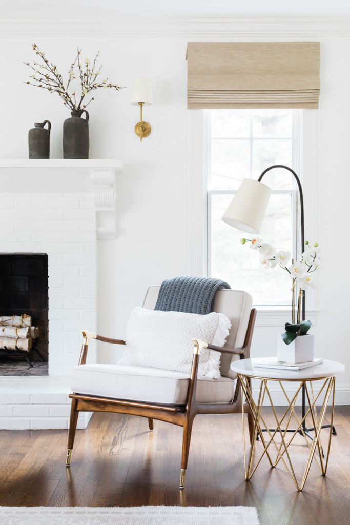

Shop the Living Room
Furniture: Addison Wall Unit in Walnut from Room & Board // France & Son Rector Marble Side Table // West Elm Mid-Century Mini Desk in Acorn (Full Sized Desk option) // White Cherry Blossom Flower Branch // Anthropologie Linen Haverhill Chair // Room & Board Tyne Coffee Table
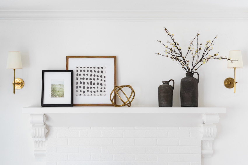
Art & Decor: Florence Candlesticks // Hills Fabric in Blue Slate (Pillows) // Cosmic Pillow // White Cherry Blossom Flower Branch // Milner Floating Shelf // Profile Frames in Walnut // Crate & Bareel Holden Vase
Rugs & Window Treatments: RH Mariposa Rug in SilverCosmic Pillow // Woven Wood Shades in Grassweave (Oatmeal color and outside mount)
Lighting: Serena & Lily Bryant Sconce (Brass Colored Option) // Visual Comfort Mia Floor Lamp
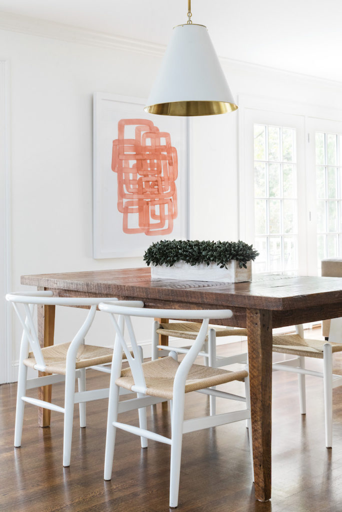
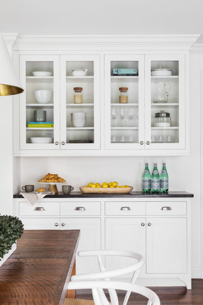
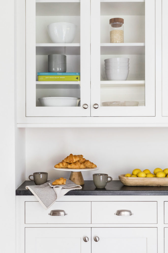
Shop the Eat-in Kitchen
Pink Knot 2 Art via McGee & Co. // Wishbone Chairs in White via Wayfair // Goodman Pendant via McGee & co.
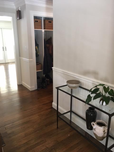
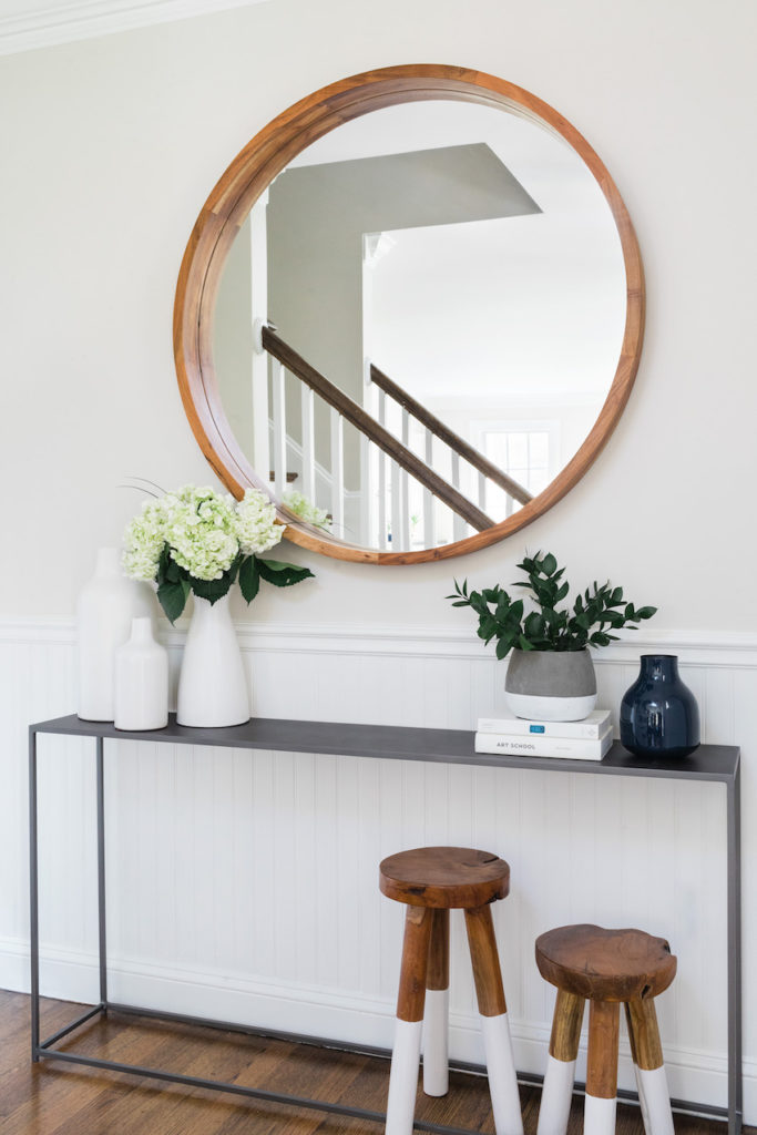
Shop the Entry
CB2 Mill Console Table // CB2 Acacia Wood 40″ Mirror //Serena & Lily Dip-Dyed Stools // West Elm Pure White Ceramic Vases
Credits: Design & Styling by Jessica Klein of Oh, I Design Studio // Photography by Joyelle West
FYI -Some contain affiliate links which means I would make a small commission should you purchase something from one of the links provided. Thank you for supporting this blog and my growing business!

