Project Details
Location: Belmont, MA
Type of Home: Single-family Colonial
Sq. Footage: approx 1,800 sq. feet
Year Built: 1942
Team
Construction Team + Project Mgmt: Tall Guy Woodworking
Cabinetry: Metropolitan Cabinets
Photography: Joyelle West
Design: Oh, I Design Studio
Project Scope
I’ve said it before and I’ll say it again: we love working with repeat clients. It’s the ultimate sign of a successful job. So when this family hired us to renovate and design their kitchen, we did a little happy dance. We had already worked together on a few projects in their home, including a bathroom renovation, living room design, and assisted with some selects for their master bedroom. We kicked off the kitchen in Summer 2019 with our initial meeting, and construction began in January 2020. I feel so lucky that our construction team was able to wrap things up before the pandemic kept us all at home shortly after completion.
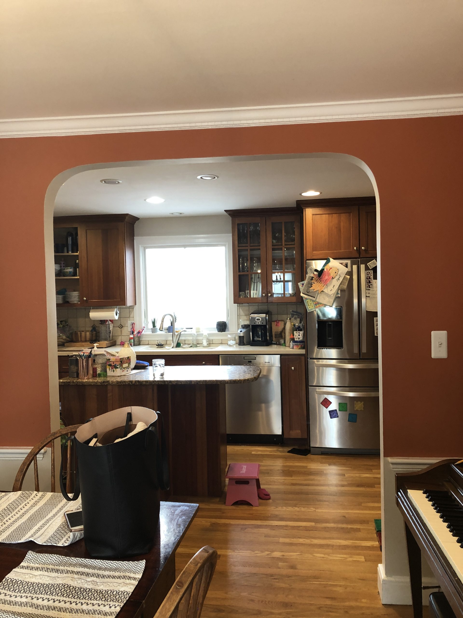
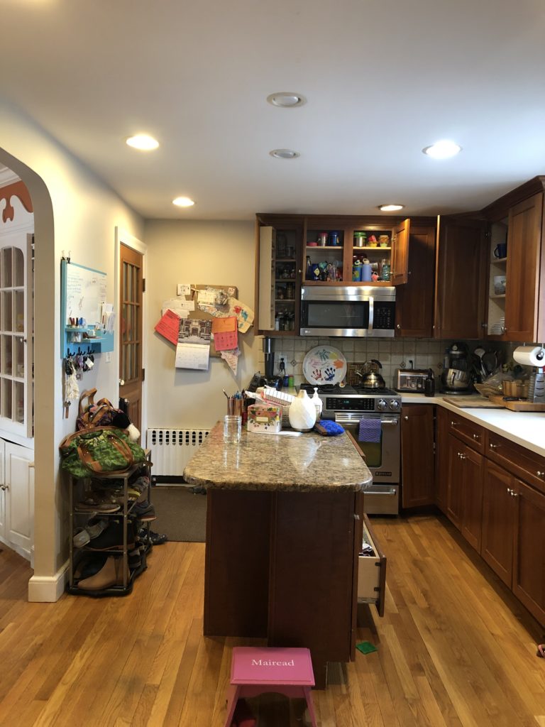
This project was especially exciting because the client handed us the wheel in every sense (another perk of repeat customers; they know us, they trust us). In the original kitchen, there was minimal pantry and storage space, and we knew this was a design and functionality issue that had to be addressed.
We started brainstorming and got to work 🙂
Design Direction
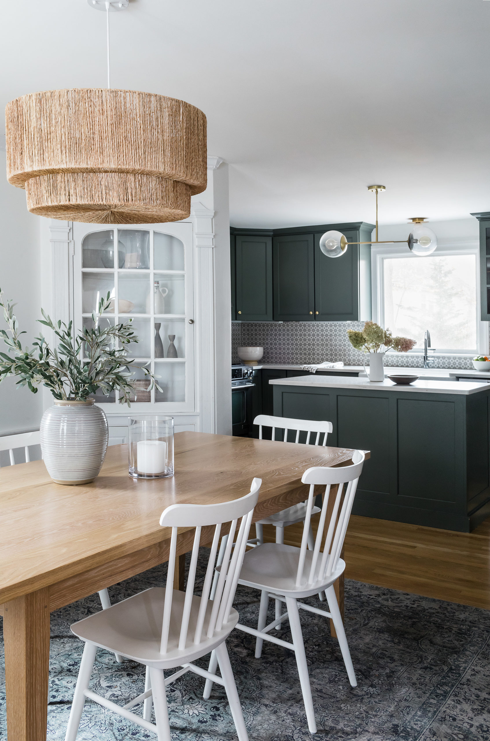
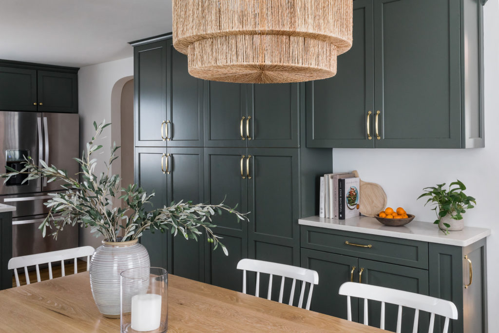
With the storage space being the prime problem to fix, we decided to go big; we wanted the kitchen to look fantastic of course, but above all, it had to function for this family. In sort of a risky move, we removed a portion of the wall that you see that goes into the kitchen from the dining room via the arched entryway to add additional cabinetry, courtesy of Metropolitan Cabinets. Before we made the big move though, we had to ensure that the wall wasn’t structural aka we worked with a structural engineer through our amazing construction team. Lesson for the day: every idea is easier thought of, than done… but totally worth it!
With part of that wall gone, it felt like one large space, but not too open into other spaces like the living room and office. Not every home is suited for an “open concept” design; it truly needs to fit the home’s layout, and the style and vibe of the occupants, but when it is made to be, it can work beautifully.
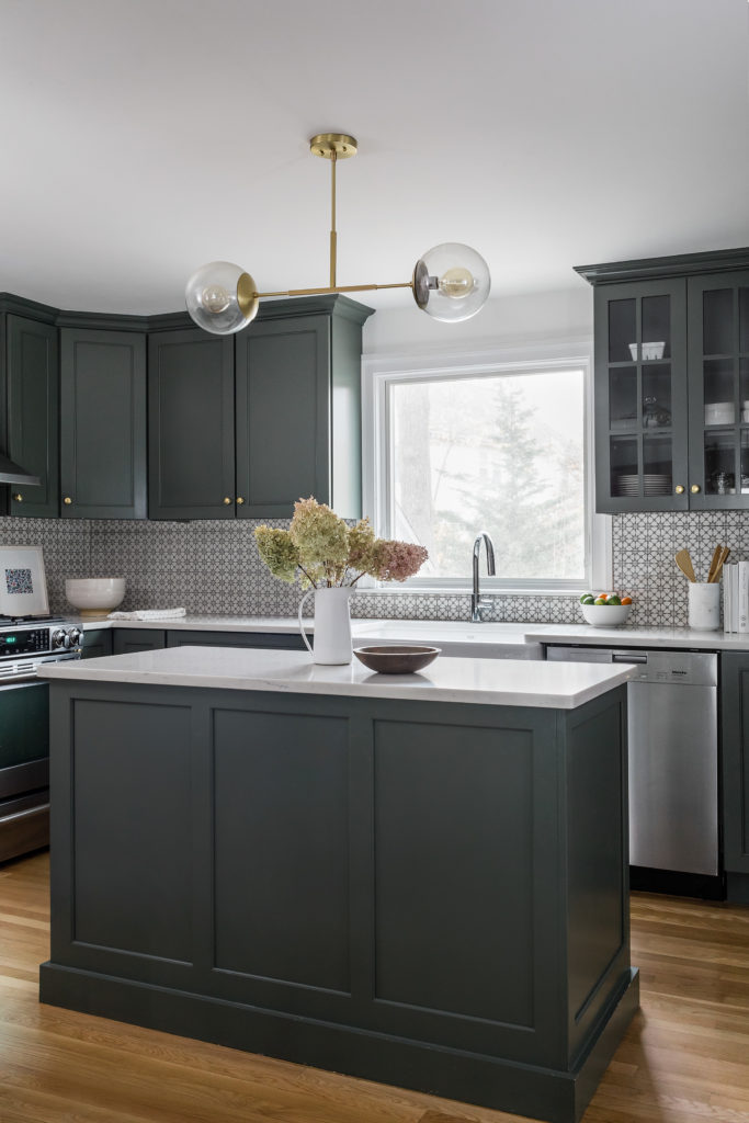
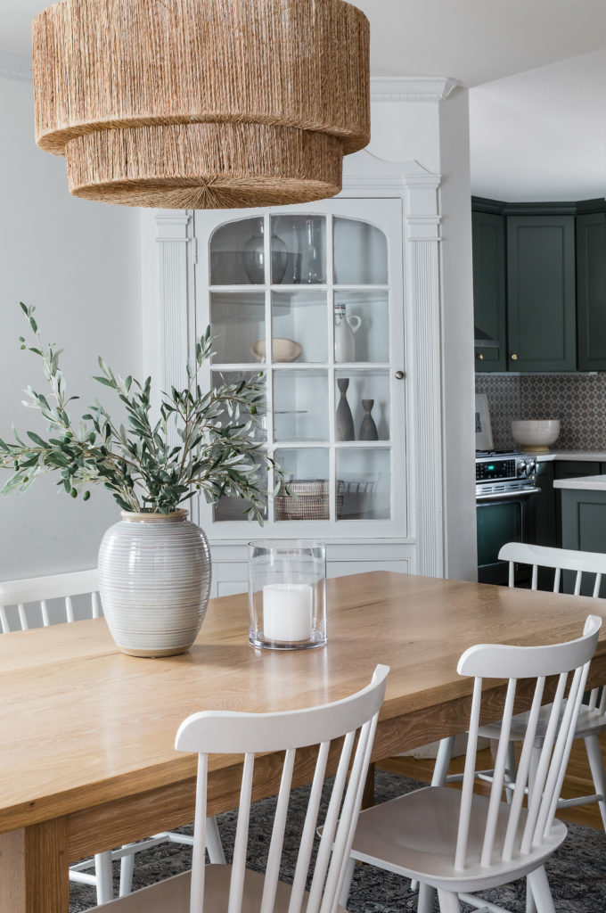
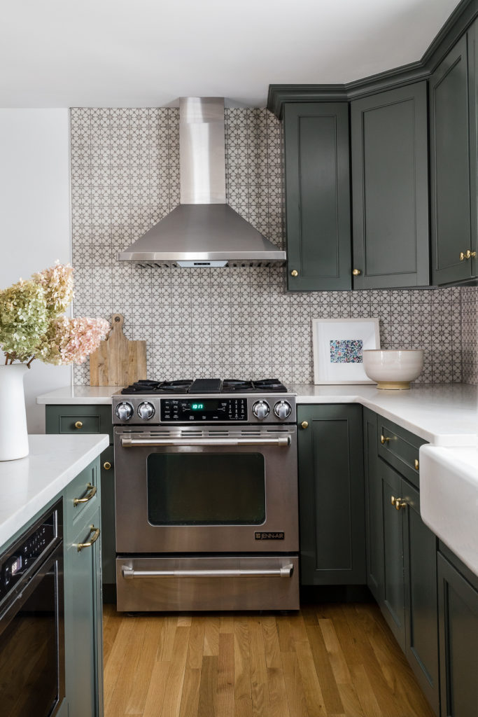
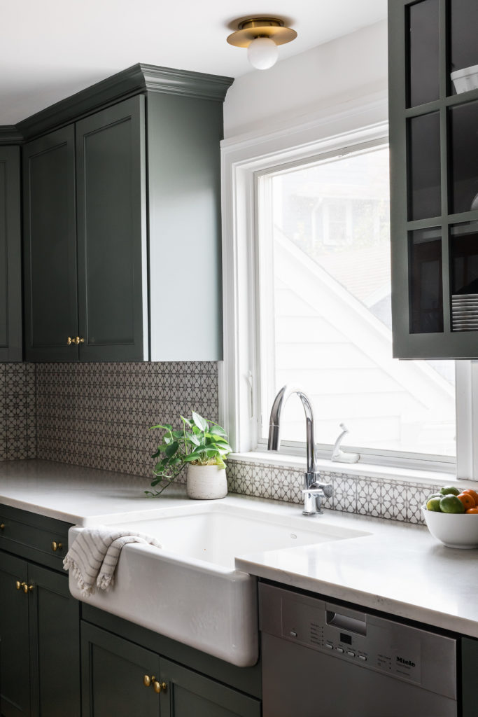
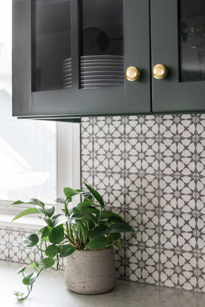
From there, we selected new paint colors for the walls and existing cabinets, backsplash, countertop, the faucet, and lighting. We used the same paint color (Benjamin Moore Chantilly Lace) on the walls all the way into the kitchen, helping the space to continue to flow well.
In addition to brass hardware for the beautiful new cabinets, we went bold and painted the cabinets a gorgeous green (Sherwin Williams Pewter Green at -20%). We loved the juxtaposition of an overall traditional style with the pop of personality and a bit of a boho vibe, with the bold green hue and the dining room light fixture.
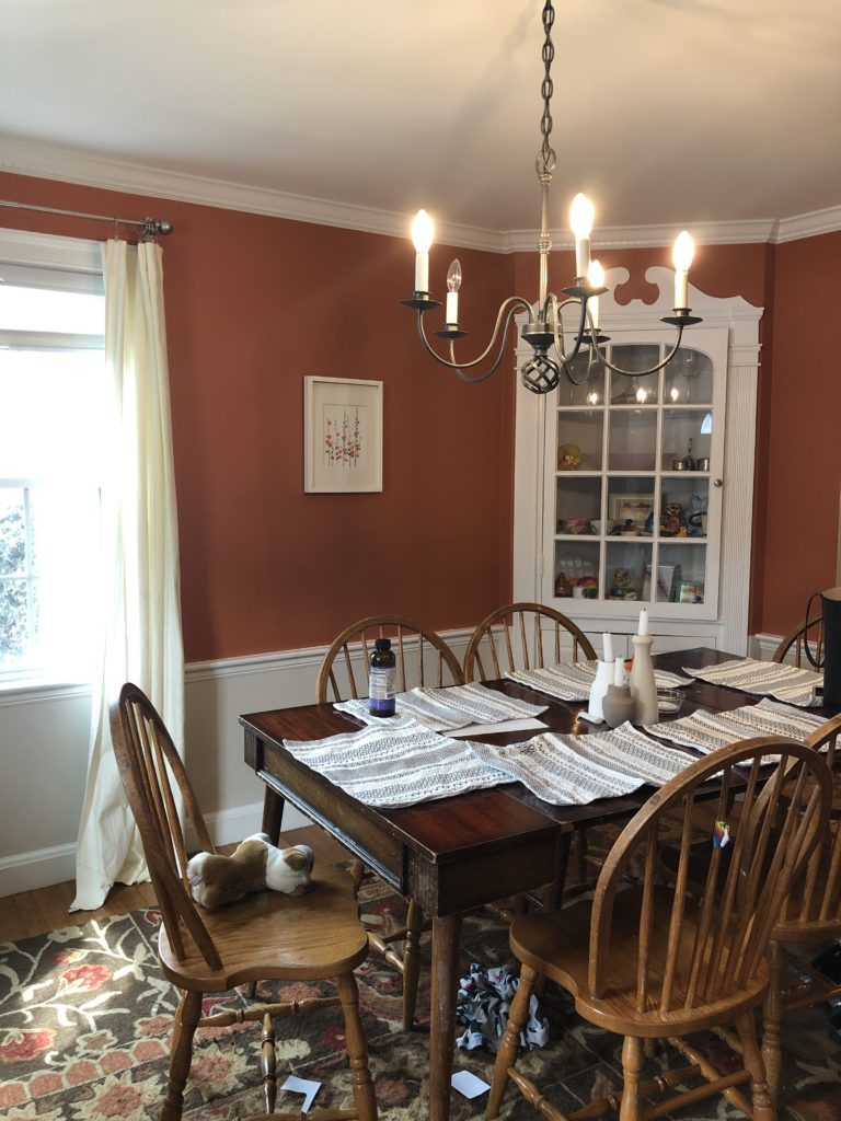
We decided to keep the original corner built-in in the dining room; it’s just too good to remove! I’m not a fan of removing every old home feature in the pursuit of newness, we try to incorporate them as much as possible. These little original touches add so much character that just can’t be replicated!
Before + After Photos
Renovated Kitchen Photos


Final Thoughts
It’s always a pleasure to work with clients again and again, and this kitchen renovation was a pure joy. I’m obsessed with the bold green shade we used on the cabinets and it made me eager to do more pops of color like this in other future projects!

