Goodness, I can’t tell you how excited I am to share this project with you! You may have seen in a previous post, but this project was recently featured in The Boston Globe!!
There are so many reasons why I loved working on this project, but I’d have to say my favorite reason is because my client loves the process of interior design and has a great eye for design. Let’s just say…she was not afraid to grab a hammer and begin hanging wall art on the spot. It was definitely a great collaboration – I would keep us on track during the project, we would both work on sourcing items until we saw it come together, and then I came in toward the end to bring it all to life through styling. Now, let’s get to some of the details and gorgeous photos by Joyelle West.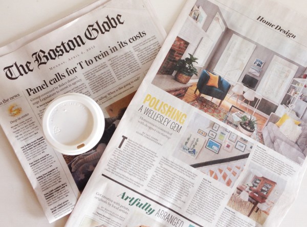 This Colonial-style home sits in the beautiful city of Wellesley, MA. It’s a gorgeous home filled with lots of natural light, nice thick white trim + molding, and the front door is bright yellow…which basically just shouts “a fun family lives here”! We both agreed on the fact we weren’t overly excited about some of the builder’s decisions (my client felt some parts of the home had a tract home feel). So in order to make this home feel more like their family’s style, we wanted to bring in a lot of modern touches and bright colors, patterns and layering. We focused on the rooms you can see right when you set foot in the home: the front room, dining area and stairwell. Here are some before + afters of the front room:
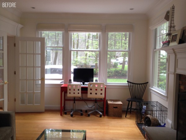
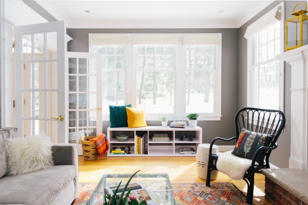
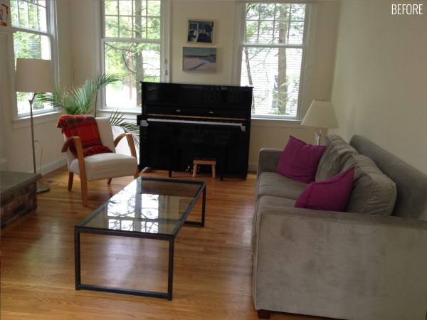
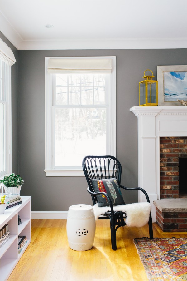
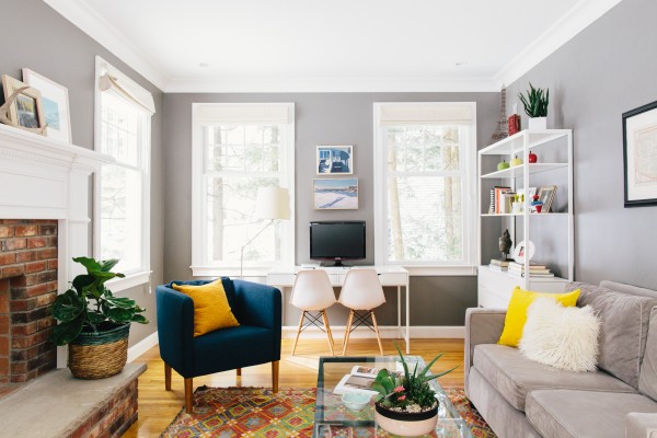 First things first: paint + layout. Initially, we thought we would go for a light gray on the walls, but then decided it needed a little more punch and a darker color to make the space more cozy. Plus, the darker grey would make the bright white trim stand out. We went with Benjamin Moore’s Chelsea Gray. As you can see from the photos, she already had the sofa, some art and coffee table.
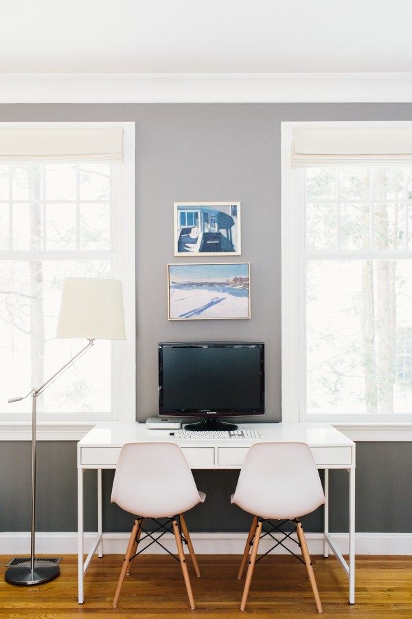
For the layout – I thought the workspace area would work better on the opposite side of the room with a shelving unit so it’s not the first thing you walk into the space. Plus, it fit better between the two windows and we could hide the cords. The placement of the sofa was great so we just added a couple chairs for more seating options (which are both from Ikea might I add…how great are they?!).
*Oh, and an awesome tip – my client bought new legs for the blue chair from Pretty Pegs and it really transformed the chair!
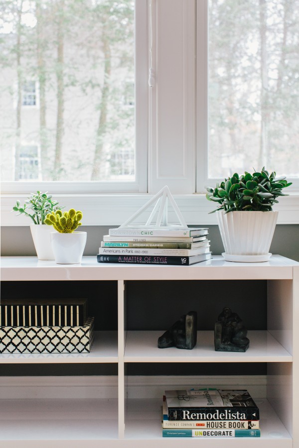
One of our challenges we faced was finding something for the wall we took the workstation from. I knew we needed something low under the windows, but they already had a rustic bench in the entry area on the same wall. So if you were standing in the front room looking out you could see both at the same time and we weren’t sure if it would be too “bench-y”. Yep, bench’y. However, this piece from AllModern worked out more like a storage piece and the stark white definitely gave it a different feel than the entry bench.
For the walls – my client introduced me her very impressive collection of art and maps. I quickly gravitated toward the maps of places they’ve lived and thought they would make a great statement for above the sofa.
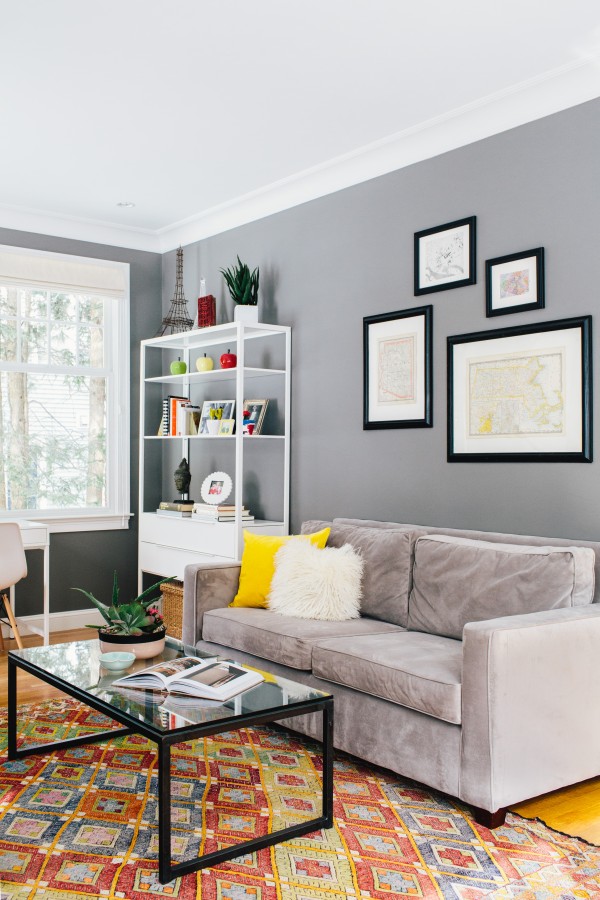
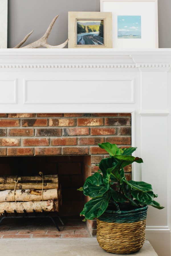
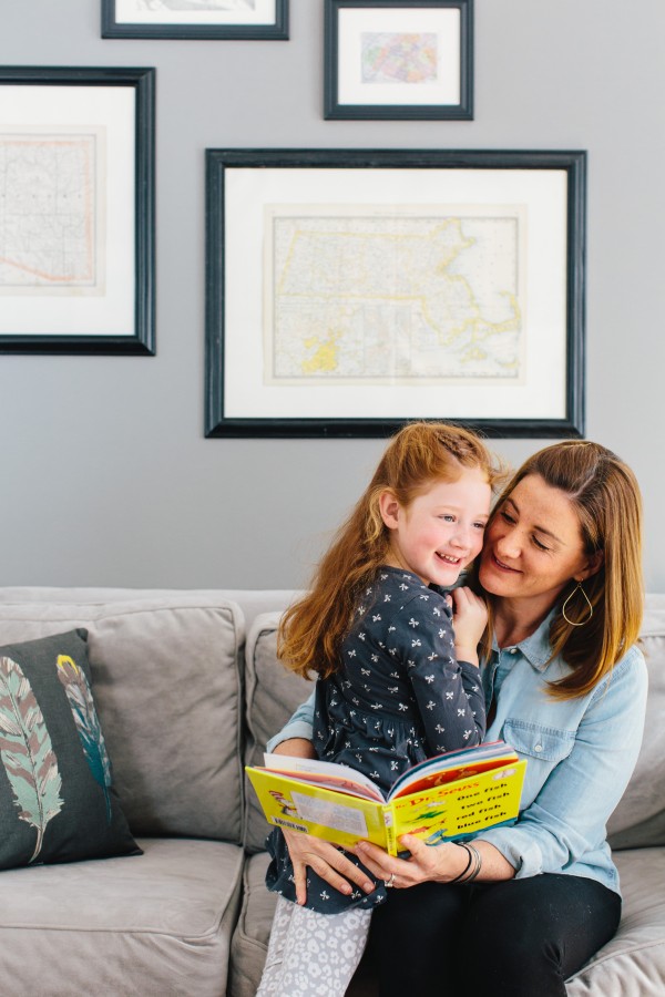 Um, can we pause and look at how cute my client is with one of her kiddos?! Their family is amazing.
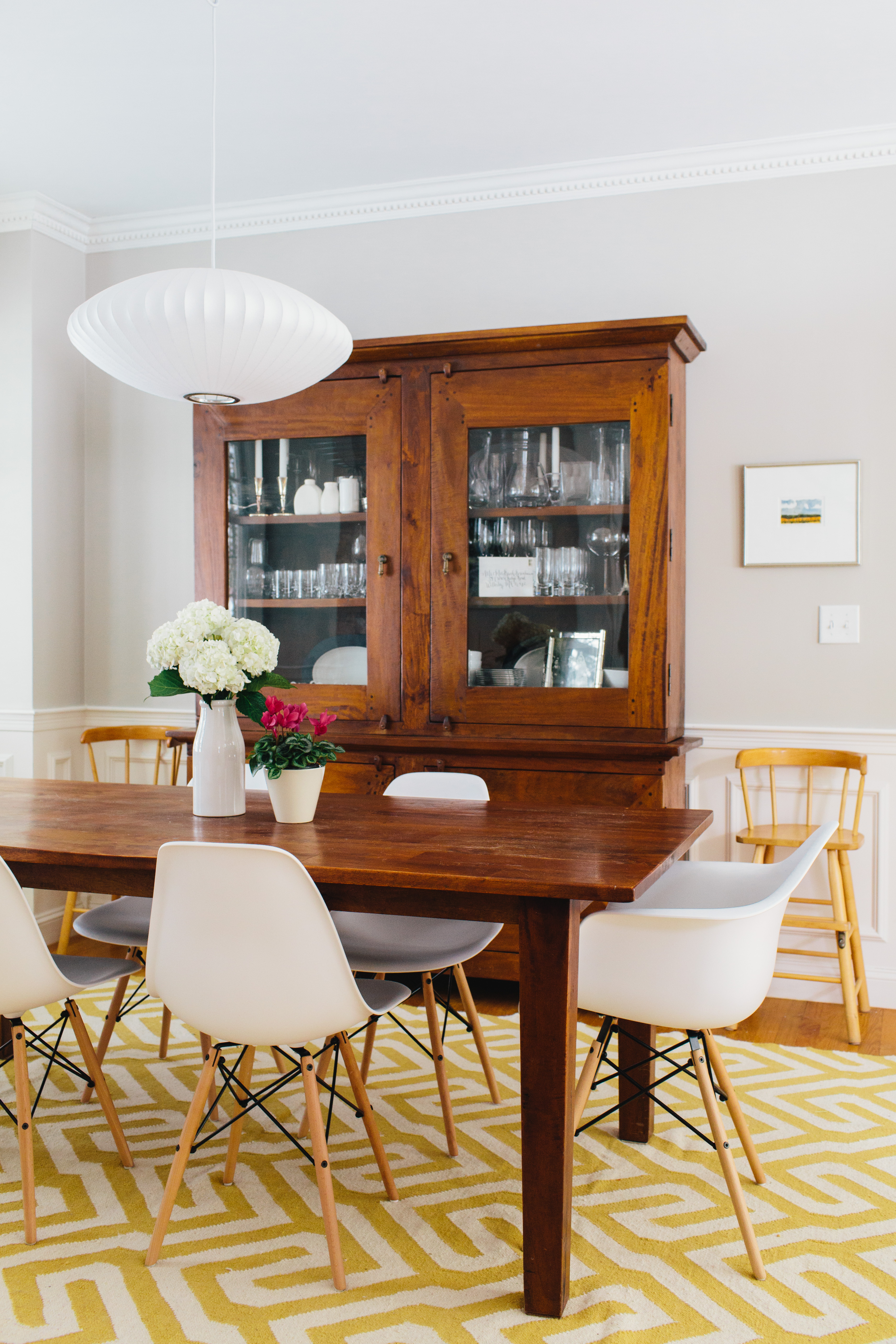
 Alright, we are onto the dining room. As you can see from the before photo below, my client already had the beautiful dining table + cabinet from Crate & Barrel circa 2005. So really, the room didn’t need a lot. Although you can’t really tell in the photos, the room doesn’t get as much light as the front room. When I was selecting a paint color, I decided to go with Benjamin Moore’s Revere Pewter which worked really well with the color of wood in the furniture.
For the light fixture, we were initially thinking of going with a couple of lanterns like this one, but my client wanted to go a little more mid-century modern. So she found a George Nelson Bubble pendant that worked well with the chairs she scored from Poly & Bark. After, we thought a bright, patterned rug was necessary to give this room a little more quirk. This one from West Elm was perfect and matches the yellow on the front door. I think it all came together beautifully – the bright white accents that my client found turned out great with the existing table + cabinet. Lastly, I went through her art collection and found a couple of pieces to hang… and voila! 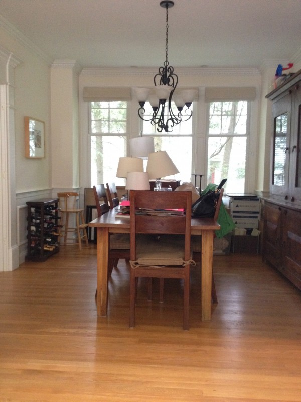
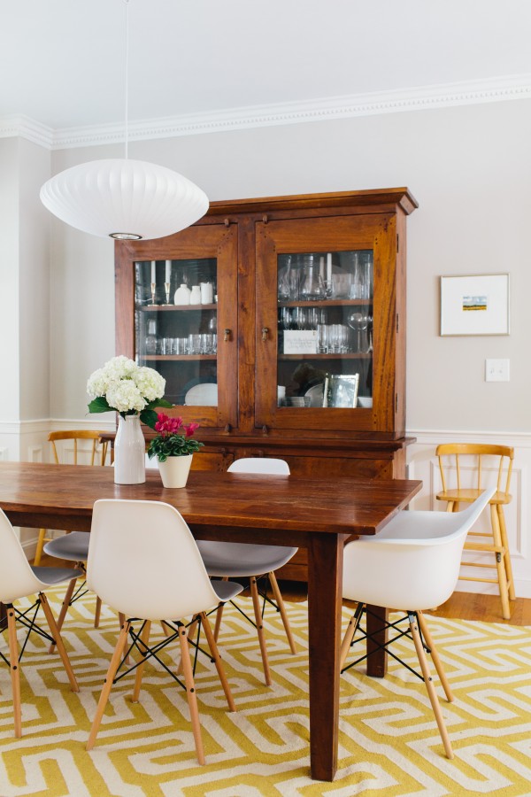
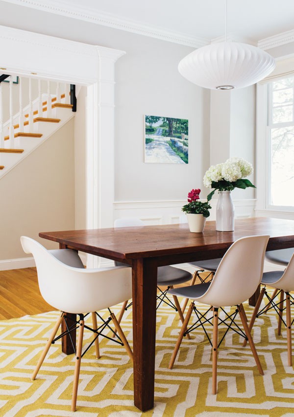
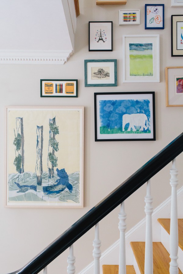
 Now one of my favorite details, the gallery wall going up the stairwell. These are all art pieces my client has curated from family, travels, her kids, etc. There were a few that we reframed, but overall they were in great condition. In order to keep the gallery wall from feeling too formal or perfect, we laid out all of the art on the floor and grabbed a hammer and nails and went for it! I think it turned out so great…and the fun part is as she collects more pieces, she can keep adding until the entire wall is full.
  *All ‘before photos’ by me. All ‘after photos’ taken by Joyelle West. Interior Design by Jessica Klein.

