Hello, friends! I haven’t done a #ohidesignhome update in a while as we have been focusing on the front exterior of our home, but now I’m excited to share we are making some kitchen updates. If you’ve been following along on my insta stories, you may have previously seen our new appliances being installed and the drama of getting the old fridge down + new fridge up 4 flights of stairs…and us almost having to pay for a $600 crane to get the darn thing up to the 3rd floor and through the front deck. Gotta love old homes in Boston. Conclusion? We told the delivery guys we could easily fix dry wall in the stairwell if they could at least try because we know it will fit. Well, they did it (cursing us I’m sure) and we tipped them well. 😉 Oh and during this time, we had to replace our hot water tank that we knew would give out eventually but were not ready for that unexpected cost on top of the appliances. Sigh.
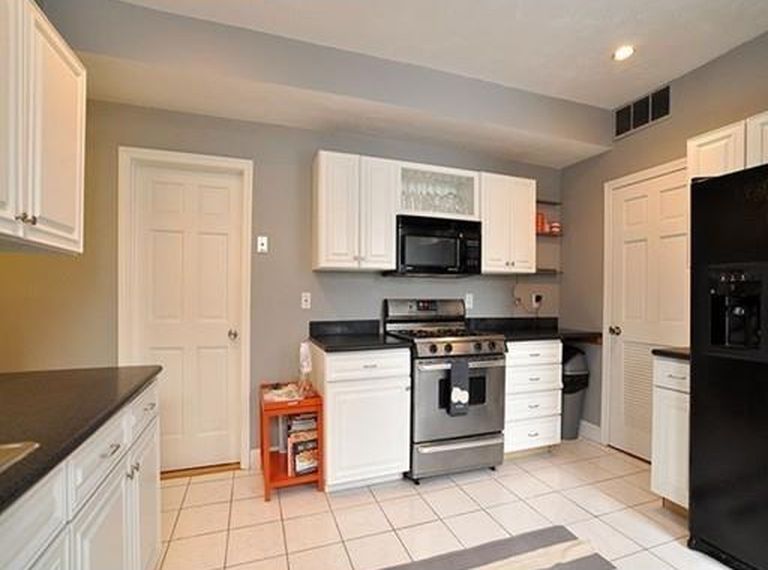
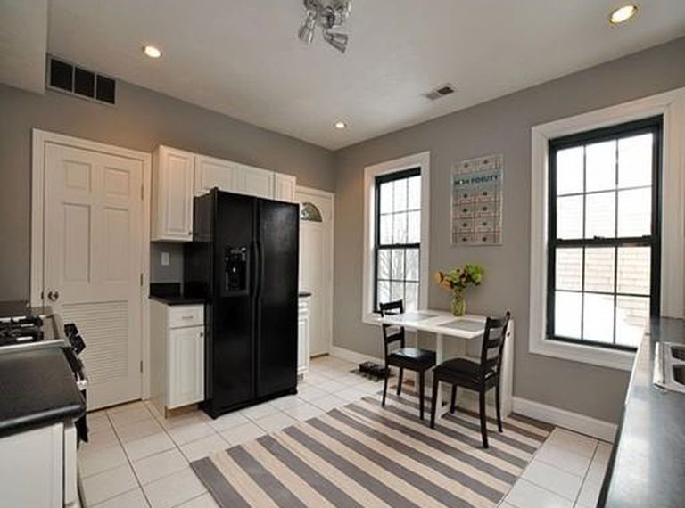
Anyway, the floor tile is cracked in multiple areas of the kitchen (you can’t see in the photos below) and the grout has been coming out little by little since we moved in. The tiles were poorly laid which is not shocking considering the other cheap and quick decisions they’ve made around the home. Side note: Evie tried to eat a piece of grout when she was really little (thank goodness I saw her do it and got it out of her mouth right away!) and I think that’s when Cody and I realized we should put the kitchen updates on the priority list. Plus we want to enjoy the updated kitchen before we sell, which could be in the next couple of years. See the before photos below. 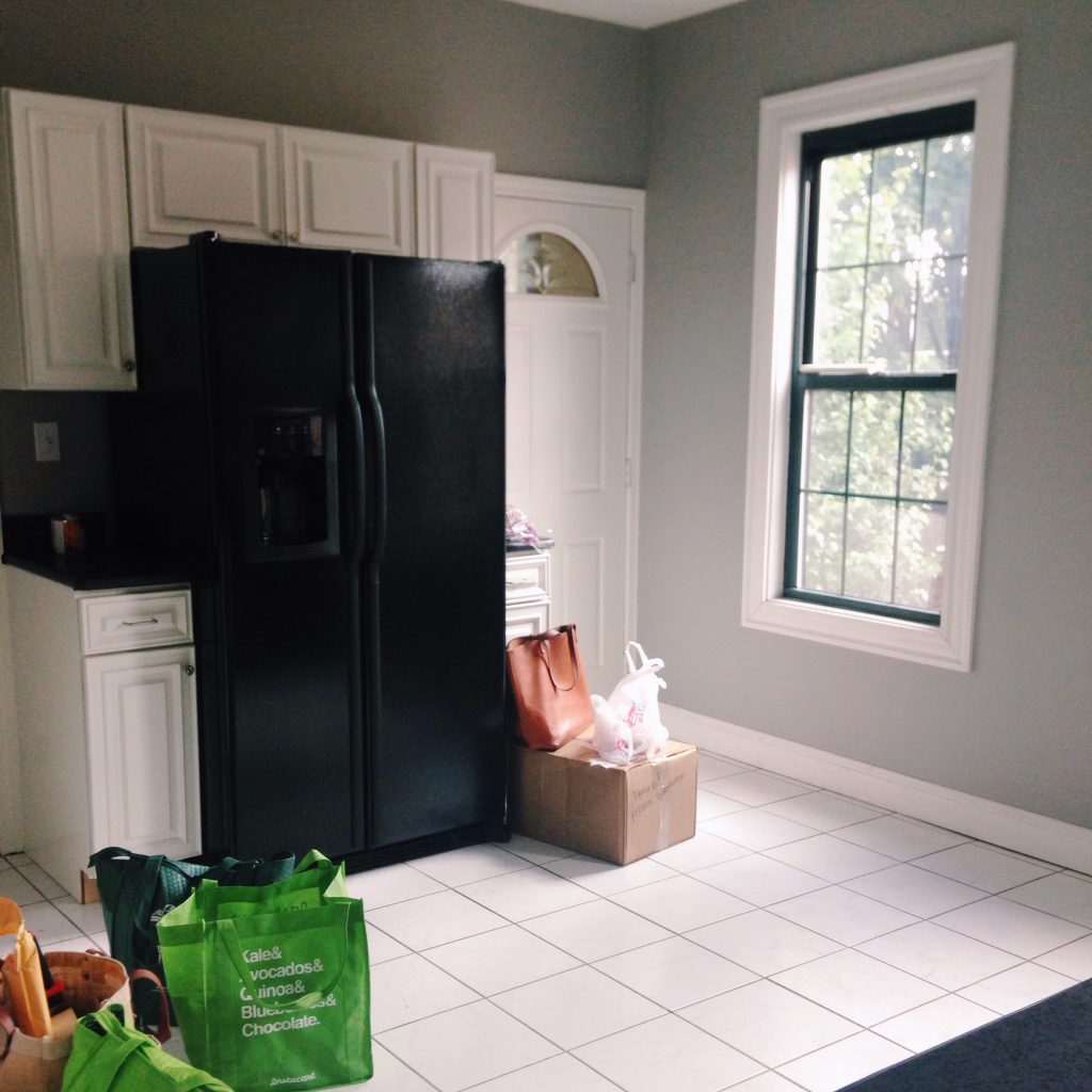 Our plan: We don’t mind the white cabinets and since this isn’t our forever home, it’s our 3-5 year home (we’ve lived here for 2 years), we decided to keep them and will be fixing some of the chips in the paint and updating the cabinet hardware. All of the new appliances are stainless steel which really opened up the kitchen, the black appliances felt so heavy in the space.
So the plan is to replace the tile flooring, the cabinet hardware, the countertops, the backsplash, painting the toe kicks, and adding a pantry area/open shelving to the right of the cabinets next to the stove/microwave.
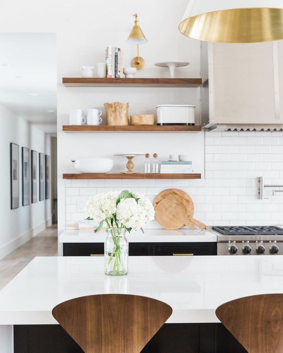
Our goal for the space is for it to feel like a modern cafe, keep it bright and bring in more warmth through the countertops and flooring. We also chose finishes that will help us when we sell our place in a couple of years (or whenever that may be). In addition, we have no pantry or storage for dry foods, so I use a rolling cart right now with glass jars, but I’m ready for some shelving to be able to organize them in a better way.
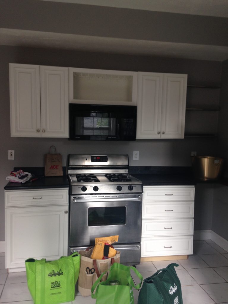
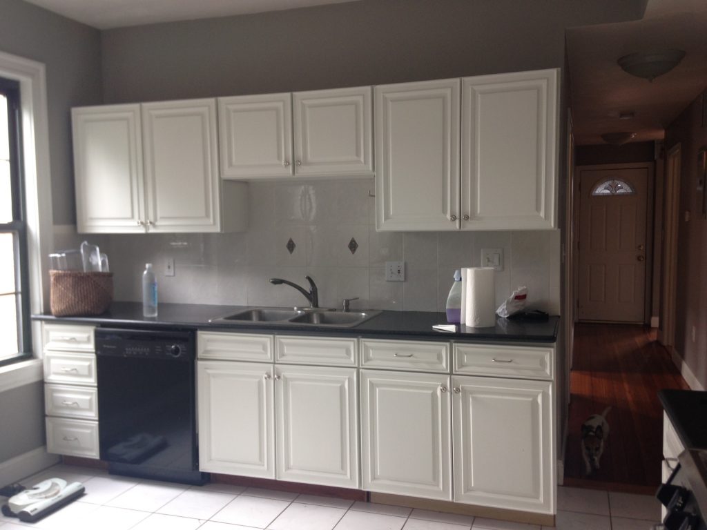 Below are a couple photos from the zillow listing (from the previous owners), but they show more of the space thanks to their wide angle lens. The photos make it look a lot better than it actually does, trust me.
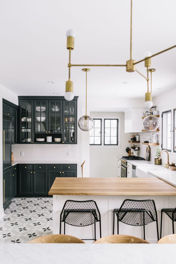
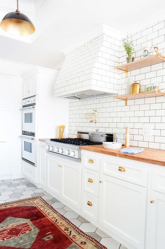
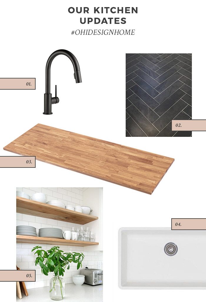 one // delta trinsic single handle faucet from wayfair – we decided to go with the matte black option and match the cabinet hardware.
two // ms international hampshire 6″x24″ slate flooring – we will be doing a herringbone pattern.
three // butcher block countertops from IKEA – I get it, everyone might be over the butcher block, but I’m not! 😉
four // we are still in search of a white farmhouse sink because our dimensions are tricky and we are looking for a fireclay option that doesn’t break the bank. 33″ wide and about 22″ deep – any recommendations?! We need one like yesterday.
five // we will be doing subway tile all the way up to the ceilings on the walls that have cabinets (I know, I’m not shocking you with any new design concepts here, but we have a very low budget…I’m my own worst client).
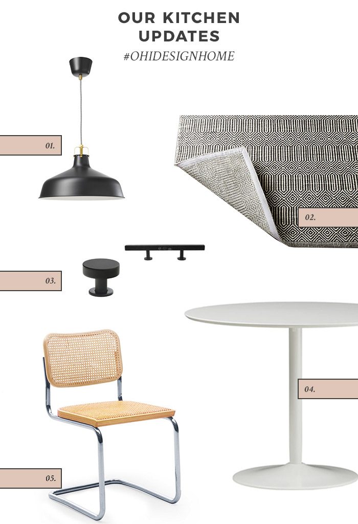 one // ranarp pendant in black from IKEA
two // we already own this gorgeous sequence rug from Room & Board
three // to tie in the matte black we are going to do these lewis pullsu & lewis knobs
four // we also already own this odysessy round white table from cb2 and think it will work nicely in the new kitchen
five // if you saw my adventure to Vermont recently on my insta stories, you will know we scored these (knock-off, unfortunately) Cesca chairs at a rummage sale for $7.50…for both!!! It felt sinful to just leave them. You can find similar ones here.
I will keep you updated on the process, but in the meantime, follow along on insta stories.
inspiration photo credits: photo one // photo two // photo three

