
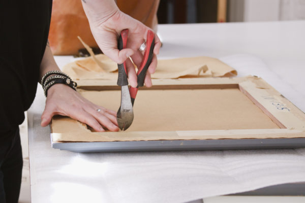
 If you are like me, you probably have a handful of art prints/pictures stashed away that are waiting to be framed or that are in beat-up old frames needing to replaced. I also have slight commitment issues when it comes to wall art. I know, seems silly when I’m able to make those decisions for clients all day long. I guess it’s how that saying goes, “the cobbler’s children have no shoes”. 😉 So, with the help of my friends’ at Jameson & Thompson Framers, I was able to give new life to our treasured architectural prints. Jameson & Thompson opened their doors in 1985 in the Jamaica Plain neighborhood of Boston. Since then they have provided services like: art installation, custom framing, fine art services, and now art sales. Today with their help, I’m excited to walk you guys through the process of custom framing!
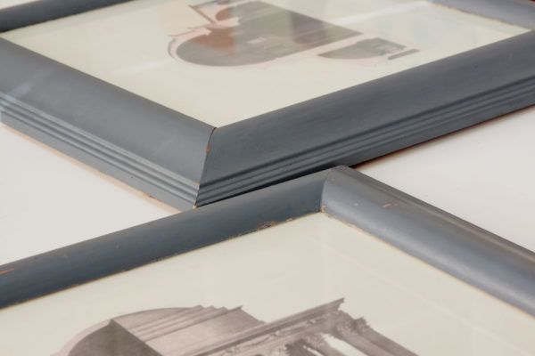
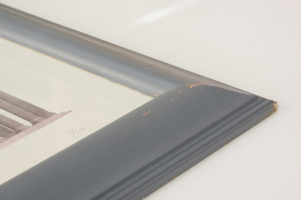
The photos below are what the framed prints looked like before (yikes).
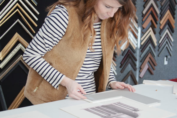
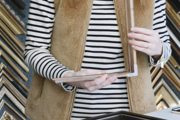
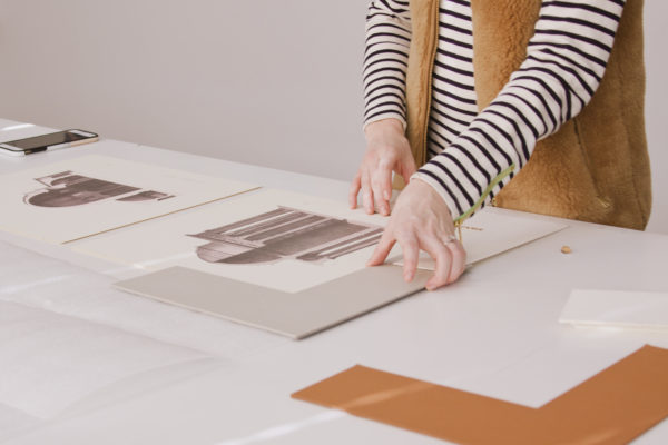 2. SELECTING THE FRAME:
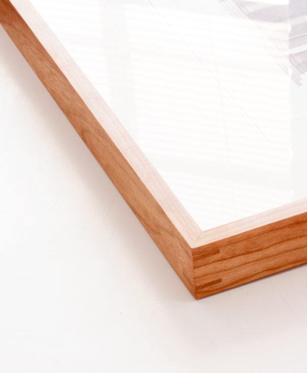
I wanted to go with something completely different than the previous frame. It needed to be more modern and fit within our living room’s aesthetic.
“After Jessica showed me a photo of where they were going to hang, it was clear that a clean, simple, elegant frame would be best. We chose the cherry with a natural finish as it has a lovely warmth to it and the orange/peach color of the wood complements the grays & purples in the artwork. To me, it’s an interesting choice to use a frame that is technically different from than any color in the art, and in this case, it works beautifully; the drawings themselves are fairly monochromatic, so to introduce another complimentary shade worked really well. The natural cherry also worked beautifully with the colors that are already in the room; I think good framing (and good design!) shows off the art in the best way possible and also coordinates with other pieces surrounding it, even if it’s a subtle touch.”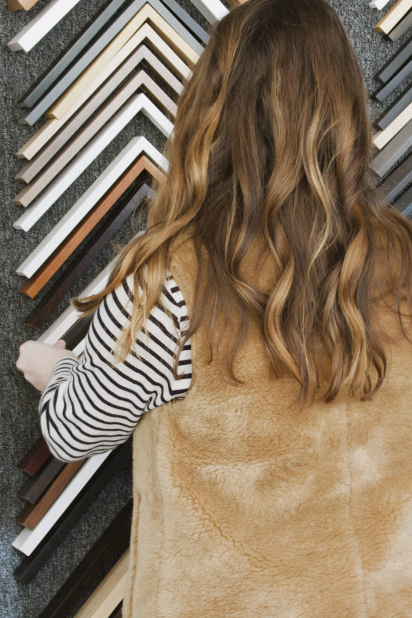
 “In 2016, Jameson & Thompson began a partnership with Adjective Art & Framing to establish a small gallery in their Jamaica Plain, MA showroom. They display a selection of beautiful contemporary art assembled by Adjective.”
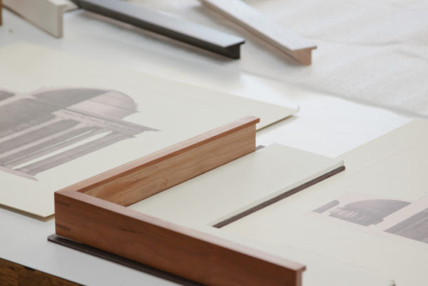

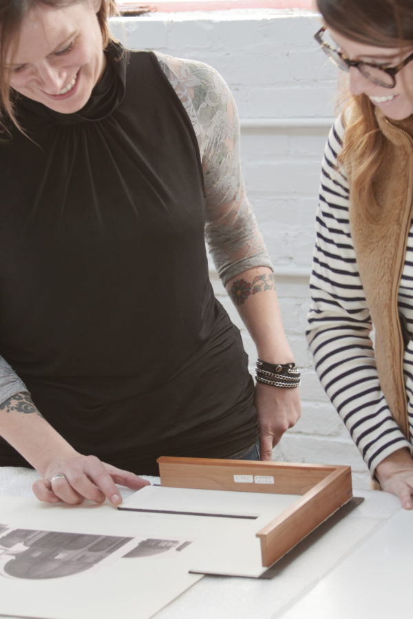
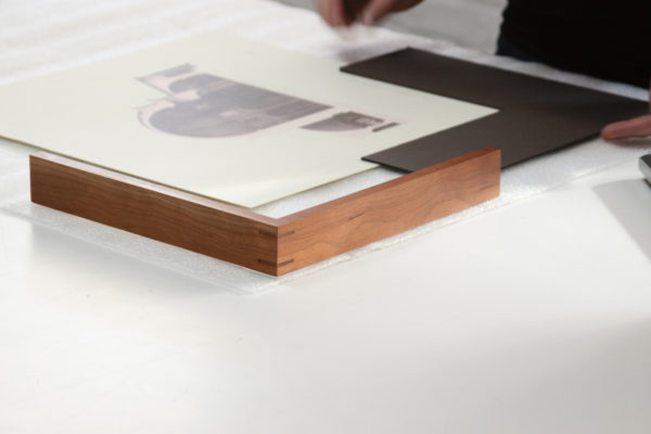
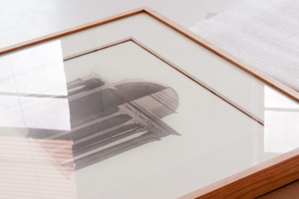
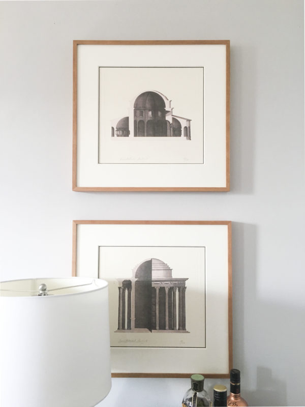
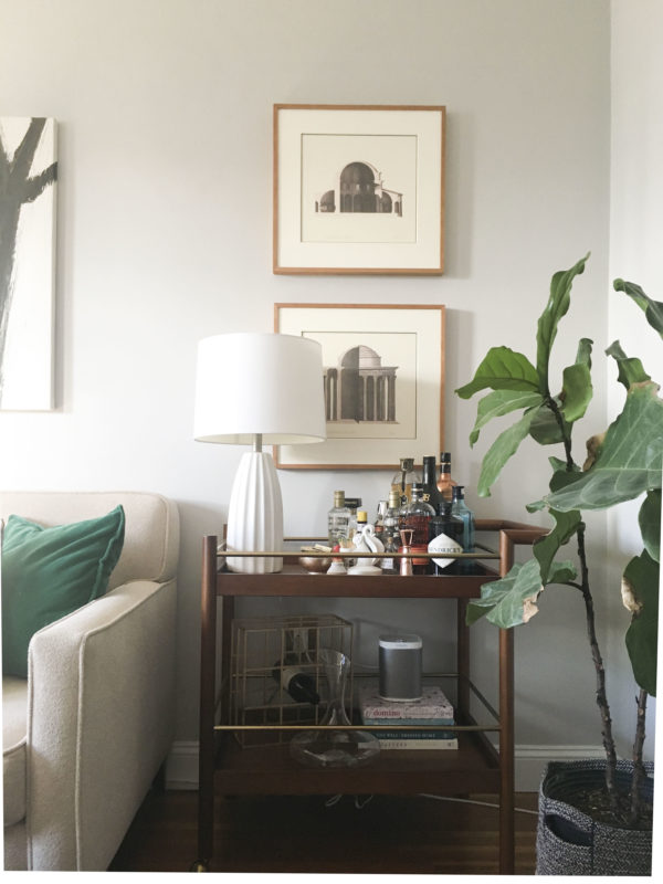
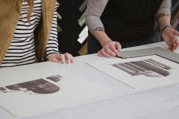
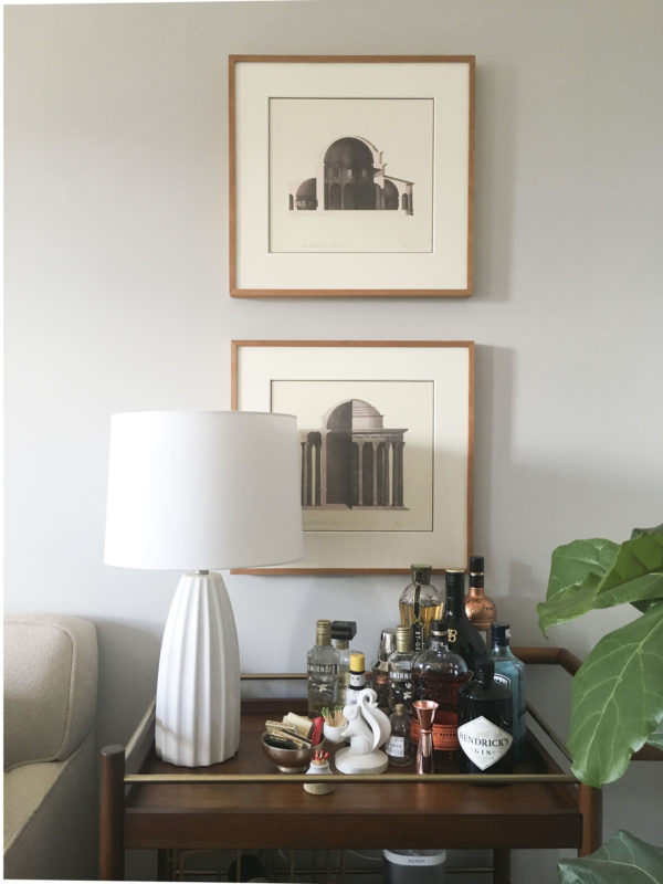 TA DA! What a transformation, right? My favorite part is Stephanie’s idea of adding a double mat but only show a tiny bit of the dark mat to break up the white and add contrast. That tiny detail made all the difference! I can’t thank the entire Jameson & Thompson team enough for giving new life to our art prints!