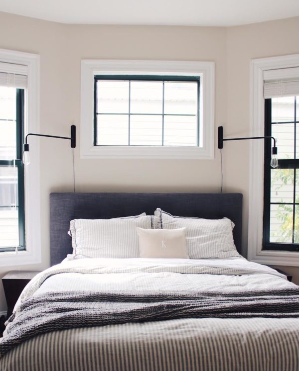
 I always find myself questioning what makes me feel a certain way about a space – is it the textures, colors, patterns, or all of the above? Does it make me feel livened or calm? When a room is high in contrast, pattern and has bold colors, it makes us feel energized.
So when thinking about how we wanted our master bedroom to feel, I knew right away we wanted a space that we could walk in from a long day and feel at ease. Most of the master bedrooms I have designed feel this way because it’s the one room I believe should be subtle in pattern and color to encourage sleep and balance. Our bedroom is a work-in-progress, as each room in our home always is, because a home should always be evolving. Am I right?
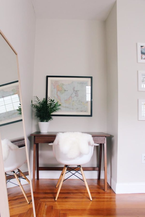
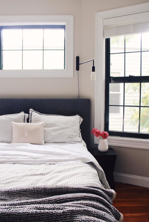
 We wanted to bring in different textures and keep it neutral, simple and not over the top. In celebration for the 10-year anniversary of the Garnet Hill x Eileen Fisher partnership, we were gifted these soft, white sateen sheets. Their partnership was built on a passion for beauty that’s “simple, pure & elegant” and one that “believes in cultivating a balanced and positive lifestyle”. They both agree that the “texture, fabric and soft color create a sense of well-being” – which matches our goals for our master bedroom.
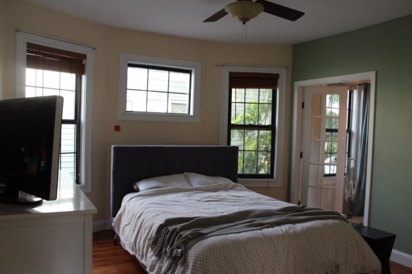
  …and just for a comparison of what the room looked like when we moved in…here you go! BEFORE:
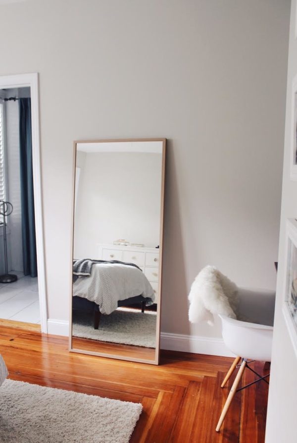 sources: bed // mirror // desk (on sale!) // desk chair // sconces // duvet cover (don’t see the exact one online, but I found it at Target in stores) // chenille grey throw // map + “k” pillows were gifts
we are in the market for new nightstands (love these) + a new rug.
Can’t wait to share more of our home!
