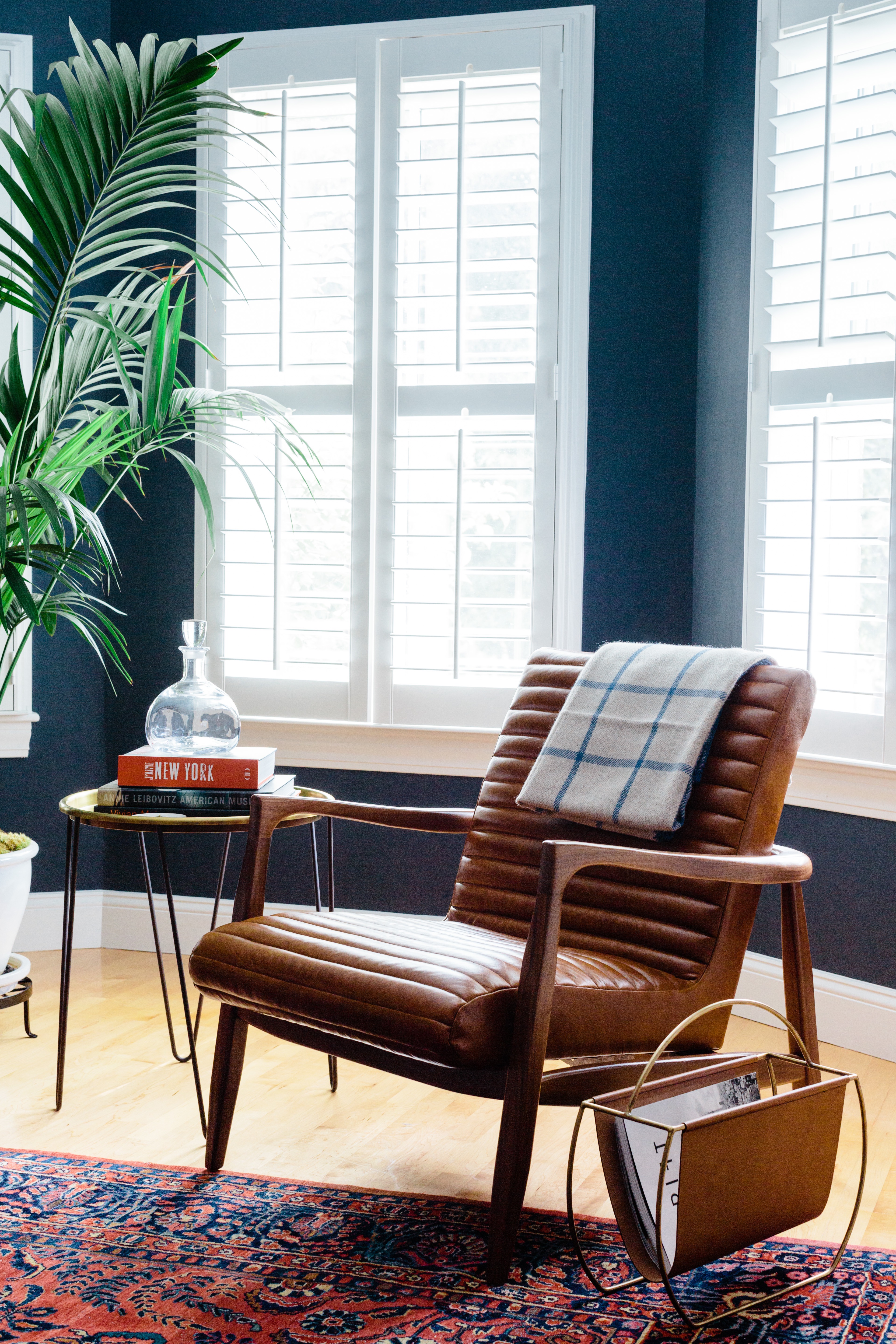
I am very excited to share one of my favorite design projects to date I designed! This 3-bedroom South End home belongs to a wonderful couple that recently relocated from Brooklyn to Boston. Here are a few before photos of the spaces we focused on (living, dining, kitchen & master):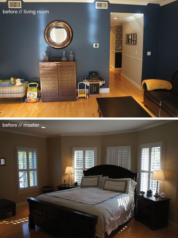
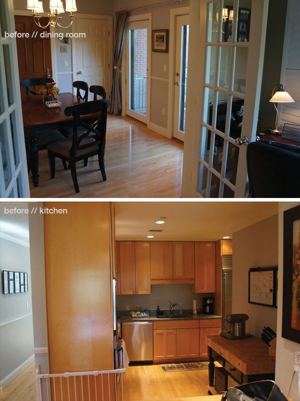 The before photos are from when the previous owner lived there, and as you can see the bones of the home were just fine. The space really just needed a little facelift through a little wallpaper and paint action…along with new furnishings/decor.
Alright, let’s dive into the after photos (because that’s what we all really want to see…right?!):
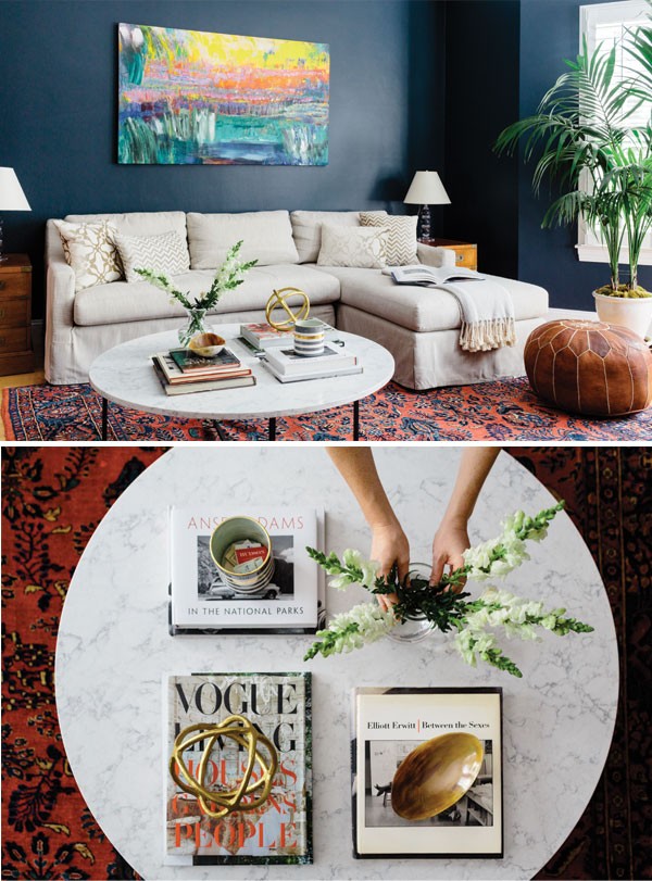
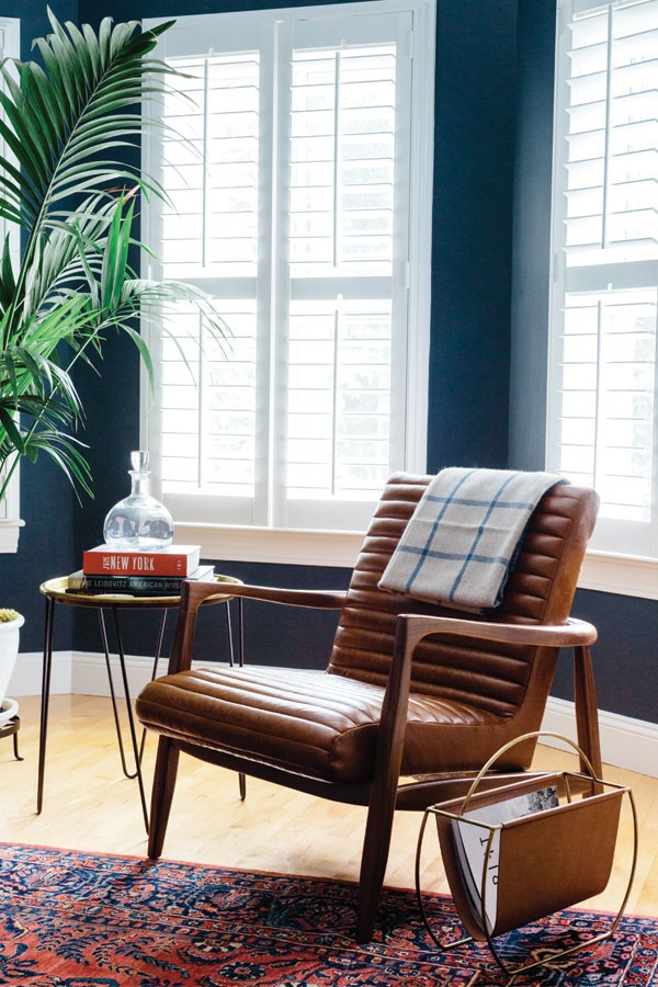 Ahhh…the living room. This room started as the most challenging part of the project due to the tricky layout. The room is actually fairly small, and we were hoping to fit a small sectional with additional seating options while still keeping the space open. The challenge was the entry to the room separated the space and we didn’t want it to feel like the sectional was too far from the other chairs that were near the fireplace. My clients and I brainstormed quite a bit working on different layout options and it turns out their existing large area rug helped ground all of the furniture so we were able to keep the sectional against the back wall without it feeling like a loner. And better yet – it feels much larger than it did before. The room was already a dark blue but it wasn’t the perfect shade of blue we were looking for so we ended up going with Benjamin Moore’s Hale Navy (a personal fave).
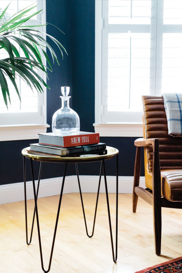
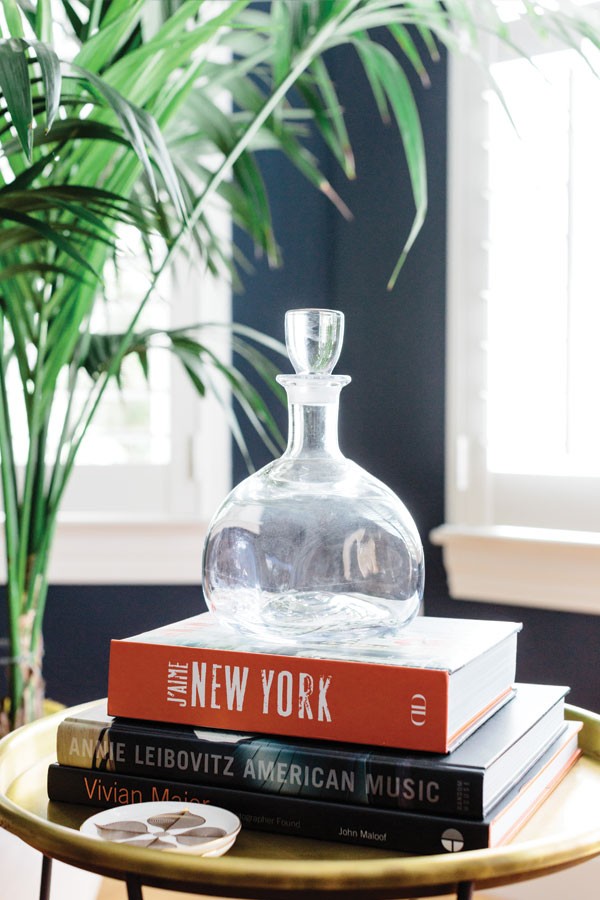
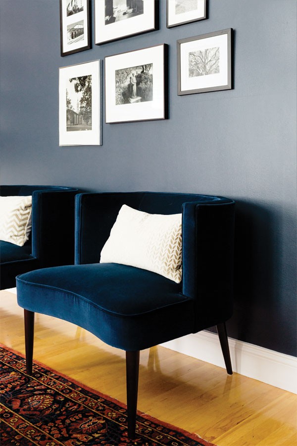 I have to give my clients credit for the two velvet navy chairs – I was hesitant with them being up against the navy wall and not being the right shade of blue, but they ended up being perfect for the space!
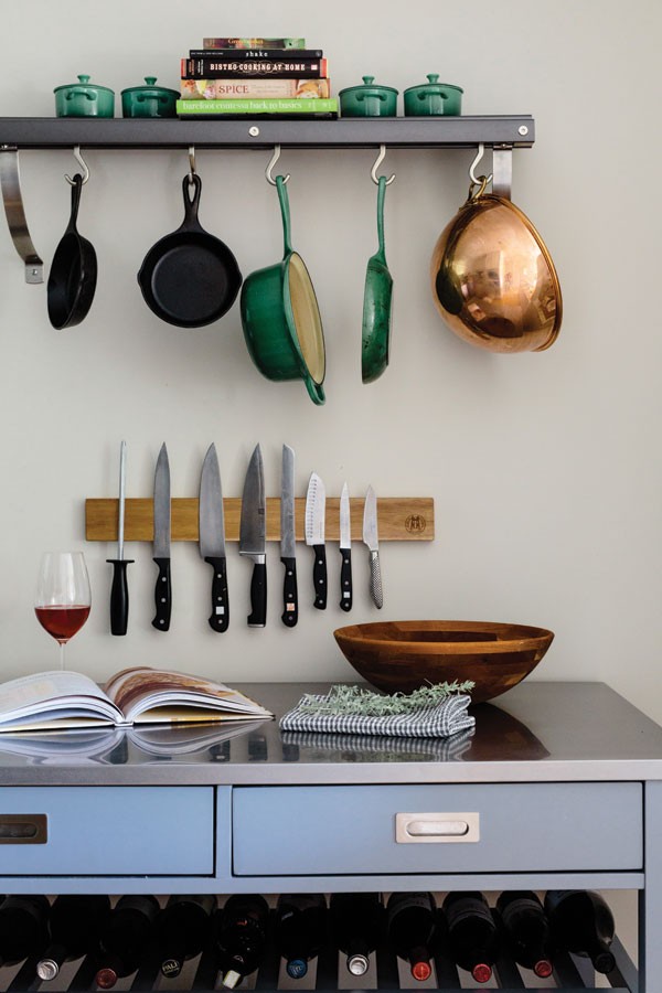
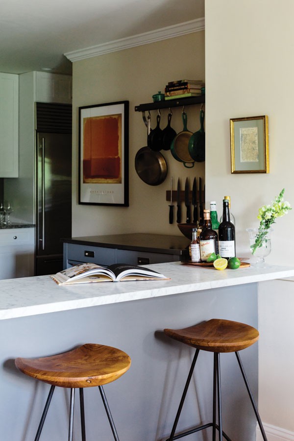
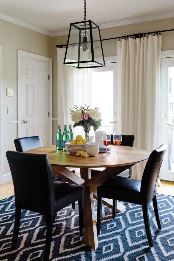
 The kitchen/dining area were really fun to work on. I first recommended we paint the cabinets in the kitchen white to give the space a fresh and clean look. Before, the cabinet color and the floor were almost the same color and it was really an eye sore. See “before photo” above. 😉 To save a little on costs upfront, we decided to wait on a tile backsplash, so I suggested painting the area a nice dark grey to give it some contrast which gave the “look” of a backsplash.
I am just a tad bit obsessed with the dining table from Lekker Home we went with – it’s the perfect scale for the space and the oak wood is so beautiful in person. 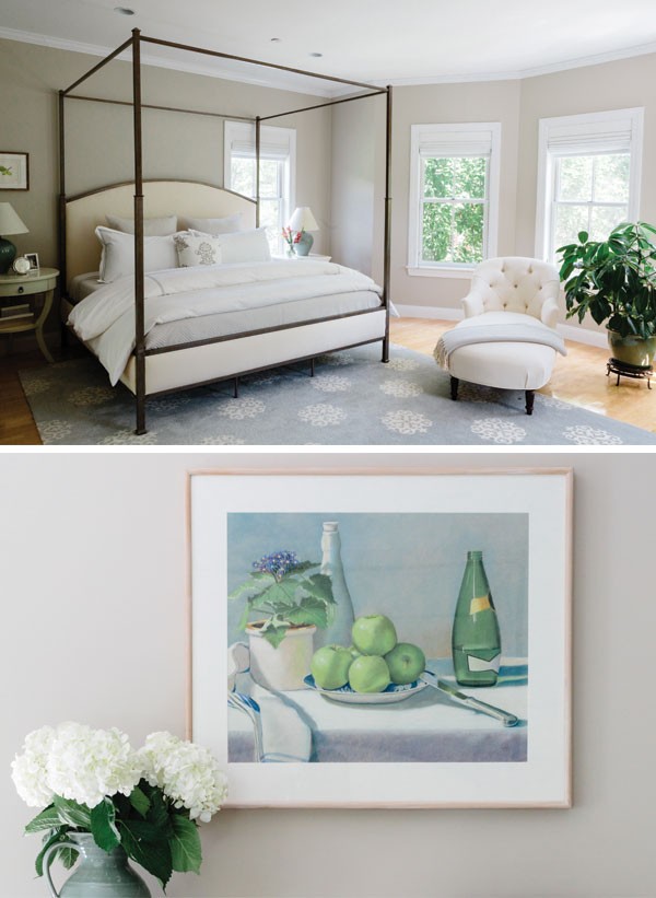
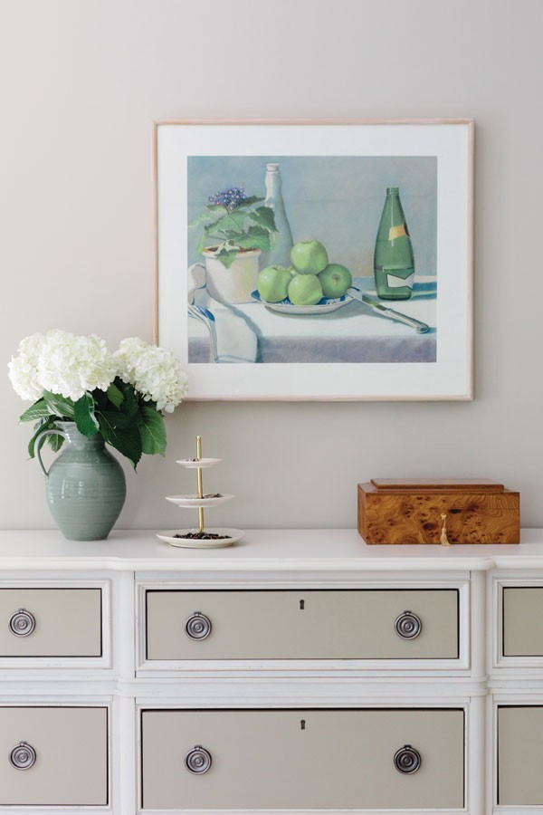
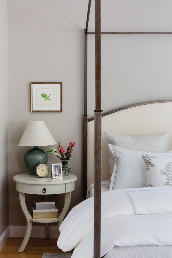 The bedroom is a space I just want to curl up in for an afternoon nap. It’s the definition of a serene and cozy space from the warm Revere Pewter color on the walls to the neutral fabrics and furniture pieces. One of my favorite details on this project was my clients’ art collection that were mostly all created by different family members. I love the juxtaposition of the abstract canvas art and black and white photography in the living room to the toned down, neutral still lifes in the master bedroom.
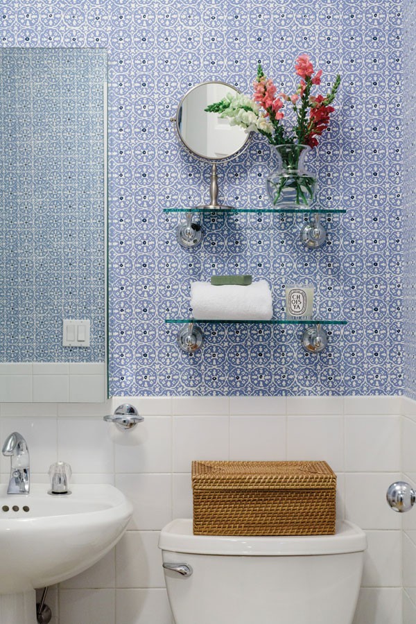 My clients and I both fell in love with this wallpaper after seeing it here. It worked perfectly in their powder bath!
Here are a handful of furniture/decor sources:
living room // sectional / leather chair / side table / velvet chairs / table lamps / coffee table
kitchen/dining // table / chairs / rug / pendant / counter stools / kitchen island / pot rack
master bedroom // bed / nightstand 1 / nightstand 2 / chaise / throw / bedding
Also, I am delighted to share that this project was recently featured on House Beautiful’s website!

