Nurseries are one of my favorite spaces to design because you can be a little more creative and play up colors/patterns. Plus newborns (or soon-to-be newborns) make the best clients ;). Lately the same question keeps coming up – “how can I create a nursery and a guest room in the same space without making it feel too baby-ish (yeah that’s a word) or too much like a guest room?”. Well, luckily all of the nurseries I’ve designed so far have also doubled as a guest room – so I am very familiar with this situation! Here are a couple of nurseries I’ve designed (that do not lack in the bold color department) along with some other nursery/guest rooms I found online.
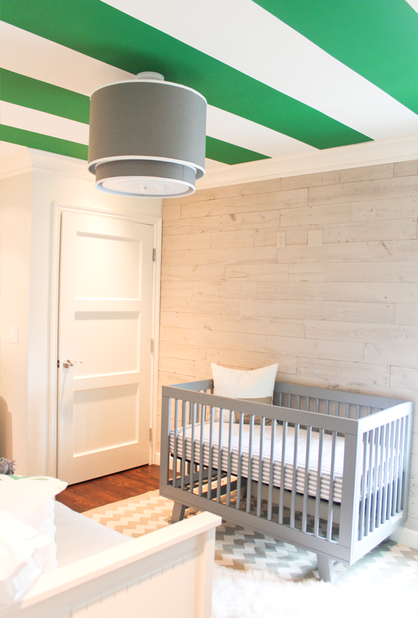
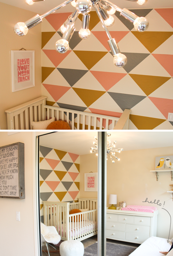
One tip I have is to create a whole look without having one space take over the other. For instance, you don’t want the nursery to be baby-overload that will take over the guest bed area. And vice versa – you want to make sure the space is still fun for your baby without making the space overly-sophisticated for your guests. 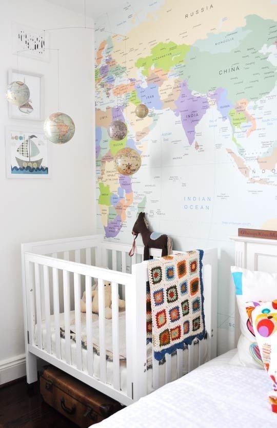 A suggestion for small spaces: use a daybed or pull-out sofa for your guest bed and then use a small side table as the nightstand or install shelves next to the bed to serve as a nightstand.
 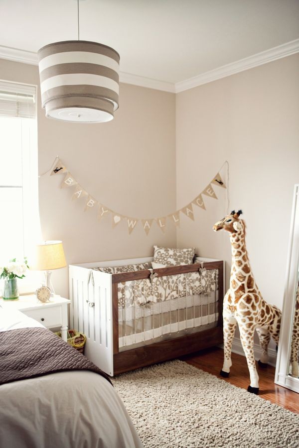 Perhaps you are more of a neutral-loving family and plan on having guests a lot, you can still create a nursery/guest room that is fun but also a little more grown up. I think I would still add a little more pattern in the space above or more contrasting colors near the crib..but this is a well-designed room.
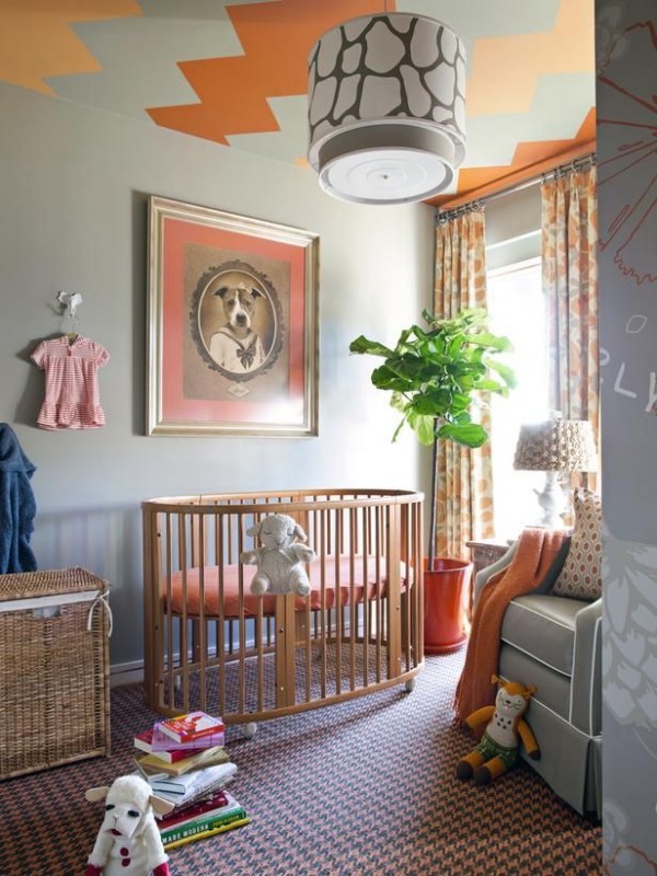 I just had to share this room – the art above the crib is amazing. They did such a great job at bringing in some interest with patterns (note: the ceiling, carpet and window treatments…oh and that pendant!). I absolutely love this space!
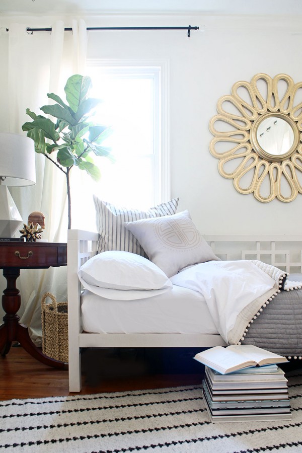 Another great example of a neutral space that works really well! I think this is a guest room and office combination – but it’s the same idea!
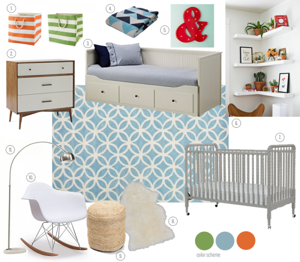 This is a mood board I put together for a client a while back who loves all things mid-century modern. They already had a color scheme in mind, but weren’t sure how to bring it all together. Their space had a built-in with a desk/shelving – so this room was to serve as their guest room, nursery, AND an office. Quite the challenge, but the fact that the desk and shelving were apart of the existing built-in helped. We decided to find a three drawer dresser that could double as a changing table and a daybed that also had storage so they didn’t need another dresser. I really like the textures and bright color combination.
Anyone else working on a room that is serving two purposes?? What are some challenges you are facing?
Shop the room: 1 // dresser-g814/” target=”_blank”>2 // 3 // 4 // 5 // 6 // 7 // 8 // 9 // 10 // 11 // corner shelving
