 click on photos for sources.
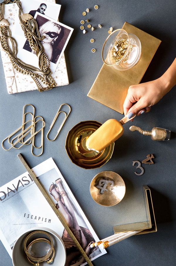
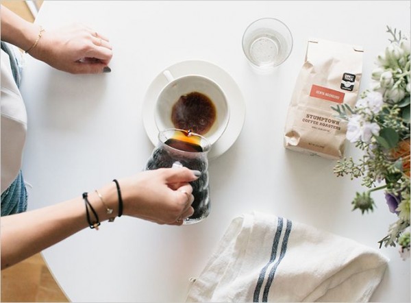
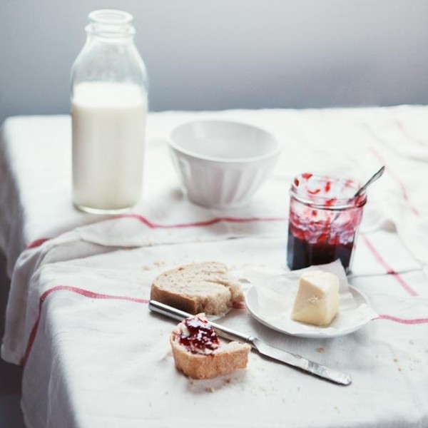
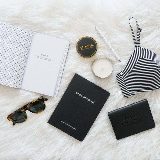
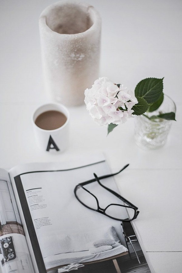
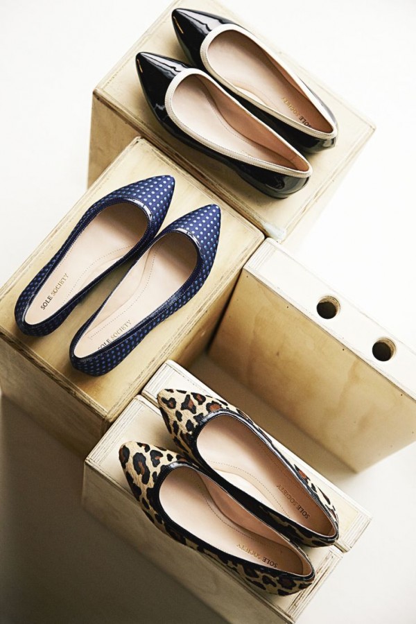
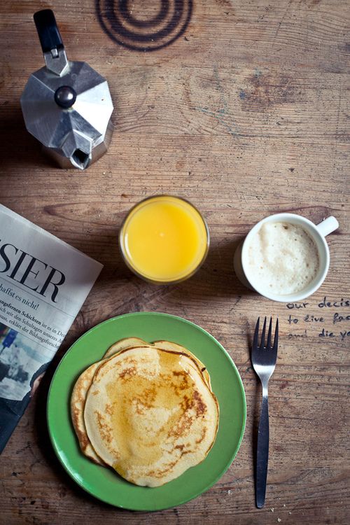
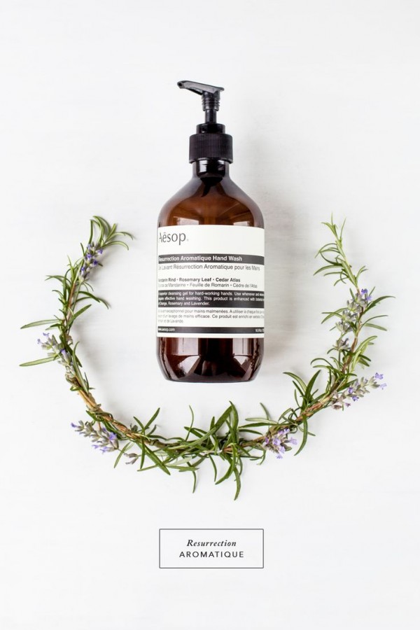
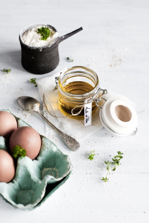
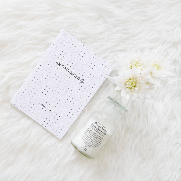
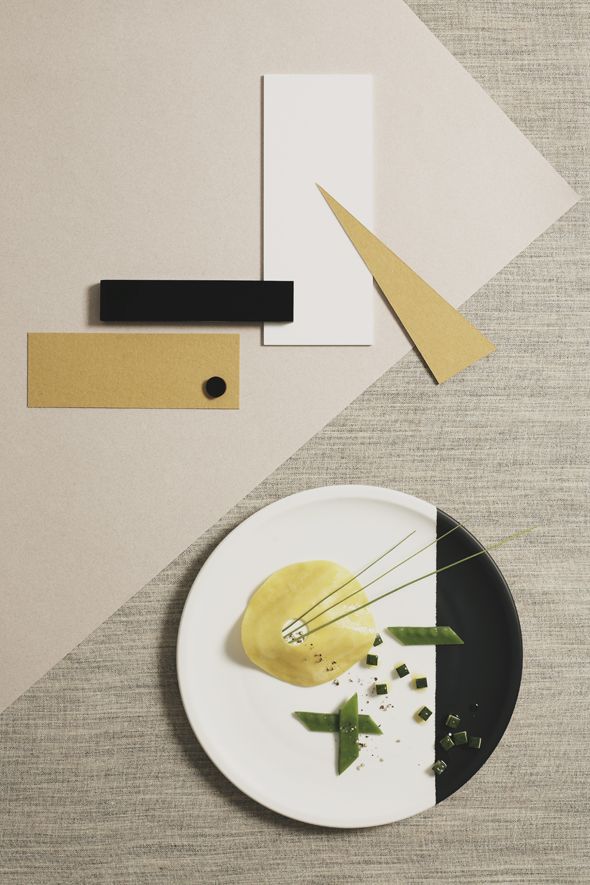
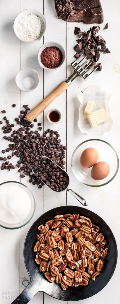
After a couple of hours of getting lost on pinterest last night, I noticed I was pinning a lot of similar photos of styling (mostly food) compositions. You see a lot of instagram photos similar to the ones above and I have to say, I love seeing how people style a lot of different objects of varying sizes, shapes, colors and textures. There are those few folks that think a lot of instagrammers will just throw a whole bunch of items on a white surface and call it a “beautiful photo”, but for the most part, there is a lot of thought and intention that goes into styling a photo. Whether it be a few of your favorite things, what you are making for dinner or your outfit for the day. The ones above which are not just instagram photos, are quite impressive!
