 Hello Oh, I Design Readers – Niki here again – for another Wear This // Live There post!
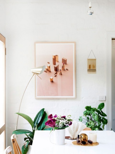
What is black and white and fun all over? This dining room, and outfit!
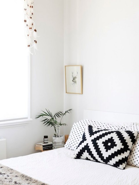
Black and white are traditionally considered a more sophisticated pair, but it’s easy to keep it light and happy by mixing patterns or materials and adding a bold pop.
My never-ceasing advice to keep things simple still applies here! Hang on to some negative space to avoid getting too busy and cluttered. Contrary to popular opinion, you can still overdo things even with such a basic palette.

Stripes are such a spectacular print for this look because it is the boldest contrast of the two colors (er…lack of color?) and is somehow almost a basic because other patterns and textures play really well off of stripes. Whether it be a beachy seersucker or pinstripe, or a classic, Frenchie, sailor stripe, stripes are always relevant in design and fashion. Always. Relevant. Agree to disagree, you say? La la la la I can’t hear you!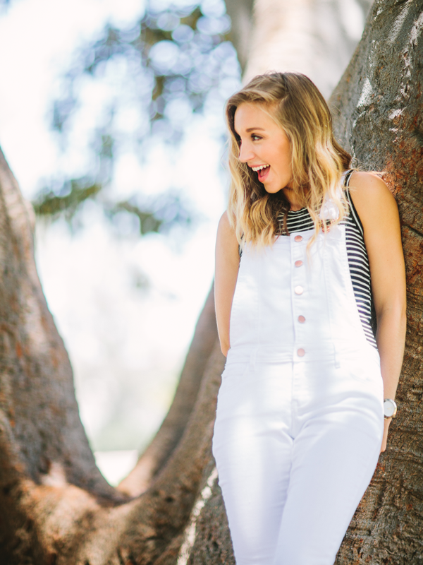

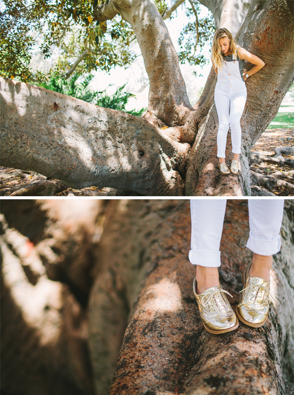
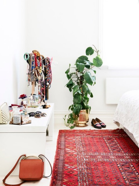
Keeping it simple for the most part allows for more play room. A pop of color in a throw blanket or pillow, for example, is a really easy way to personalize and liven things up. I personally love a stack of colorful books or a medley of colored pots grouped together with some indoor plants. What I’m seeing more and more of are metallic hues. Go ahead, mix your metals. Unless you are the Duchess of York and only find it suitable to wear more gold with your gold, it is now officially ok for all metallics to intermingle. Cohabit-ate. Get really progressive, and stuff.
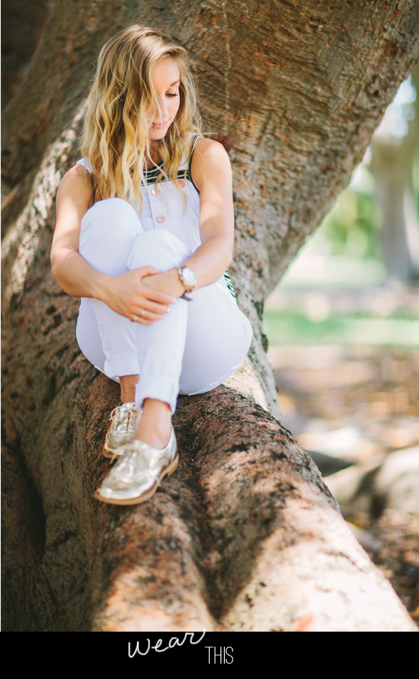
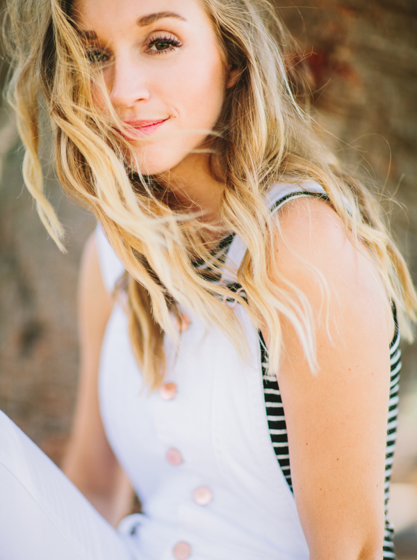
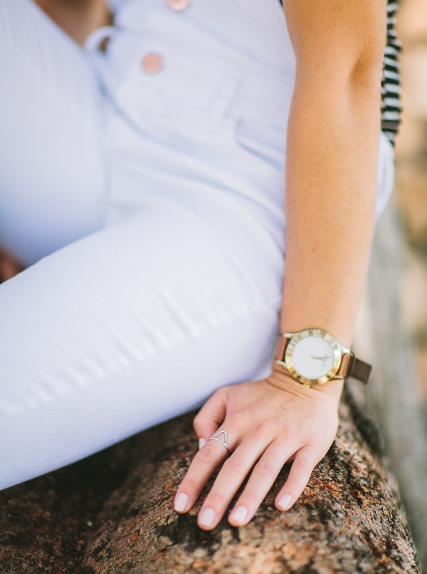
Here we are rocking white skinny overalls with rose gold detailing on the buttons and some in-your-face gold oxfords by Sam Edelman. Why don’t you find yourself offended by this Midas-esque touch? Maybe it’s the simple black and white palette. Or maybe they’re just really cute. But I always advise keeping the majority as basic as possible when introducing bright or metallic details. It’s only fair that they should steal the show as your focal point.
CREDITS +
PHOTOGRAPHY OF NIKI + WEAR THIS: Let’s Frolic Together
INTERIOR PHOTOS: Cheerful Melbourne Home via The Design Files
COPY + STYLING + MODEL: Niki Lesmeister
OUTFIT: Sam Edelman Oxfords, Brandy Melville tank, TinselTown Overalls

